
You subscribe to a company’s emails. Then, lo and behold, your inbox gets hit with a stream of random messages over the next few days.
It’s happened to me more than once. And without a proper intro after signing up, I usually forget why I did it in the first place.
Did I see their ad on social media?
Have I seen a blog post or news about them?
What I do remember, however, is the barrage of disjointed emails that had me reaching for the unsubscribe button.
You can’t blame me. In 2024, 361.6 billion emails were sent every day, spread across 4.6 billion users. That’s easily 100+ emails per person daily, with a huge chunk coming from brands all fighting for our attention.
Making time to design a great welcome email could give your brand a spotlight moment, something to anchor you in your new subscriber’s mind.
Next time they see you in their inbox, they’ll know who you are and why they’re still subscribed. What's even better, it's a simple act of courtesy. One that can make them pause and think, “I’m in the right place.”
In this piece, I’ll guide you through the best welcome email examples, with 30+ smart, swipe-worthy ideas from 17 standout brands.
What is A Welcome Email?
A welcome email is the first message someone receives after they’ve joined your list or opened an account with your company. Because of that, you’ll also hear it called a post-signup or after-signup email.
As a whole, welcome emails do a few key things: they welcome, inform, and establish a relationship that (ideally) ends up in conversion.
Here's what that can look like:
- A warm, personalized hello for your new subscribers
- A simple yet impactful intro to your brand or product—what you do, and why it matters
- A spotlight on your most important offerings or features (the stuff you’re proud of)
- A thank-you, whether that’s a kind note or a little welcome gift
- A nudge toward what to do next—browse the shop, start a trial, or use that welcome bonus
These emails are usually automated, since 74% of consumers anticipate receiving them as soon as they sign up. They can stand alone as a triggered message or be the opening note in a broader drip campaign (a fancy way to call a series of emails designed to guide someone along a journey, one step at a time).
Why Do Welcome Emails Matter
If the intro to this blog post didn’t land on a gut level for you, don’t worry. I’ve found stats and studies to back up my point:
- Welcome emails’ open rates are extremely high—84% of people want to see what the message is all about.
- Engagement is also very good. Welcome emails receive 17% click-through rates and 19.85% click-to-open rates.
- Leads are most engaged right after they show interest. Quick responses (within an hour of initial contact) can increase sales conversions by 14.5%.
- Welcome emails convert. It has a conversion rate of 3%. That’s higher than abandoned cart emails, which are primarily designed to nudge shoppers to buy.
Learn more about why welcome emails are important in our video below:
Are you now convinced that welcome emails are worth the time and effort?
Great! Up next, I'll show you how to design them well through some of the best welcome email examples out there.

17 Welcome Email Examples to Inspire Your Own
Real-life examples help you spot what works and discover which elements you can use in your emails.
Below, you’ll find 17 welcome email examples, with a breakdown of 30+ elements you can borrow—so you can make yours even better.
I’ve grouped them by industry so you can skip to yours if you wish, but I recommend scrolling through them all. You’ll pick up different tips, tricks, and takeaways from each one.
Ecommerce / Retail
According to Omnisend’s 2025 ecommerce marketing report, ecommerce brands that run this type of campaign can see results like:
- 34.79% open rate
- 2.91% conversion rate
- 58.26% click-to-conversion rate
Here are some examples to help you get the most out of what a good welcome email has to offer:
1. Caintè
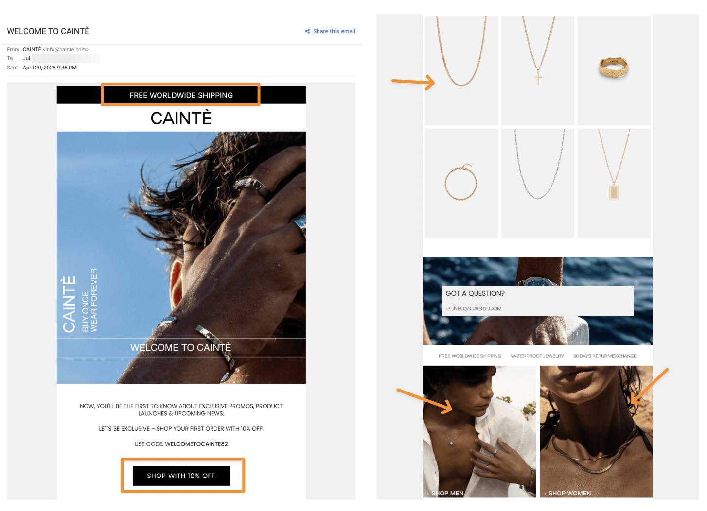
This welcome email example from Copenhagen-based jewellery brand Caintè leans heavy on the imagery. This makes sense: for many retail brands, visuals matter because they help tell your story.
What you can borrow:
- Freebie placement that pops. “Free worldwide shipping” and the 10% off welcome offer are placed front and center, above the fold—exactly where eyes go first.
- Clean product gallery. A white background and minimal framing let the products do the talking. It’s a reminder that you don’t always need flashy presentations to be effective.
- Lifestyle-driven CTAs. Instead of plain “Shop Men” or “Shop Women” buttons, they added beach-ready lifestyle shots to make the categories feel aspirational.
2. Fulton
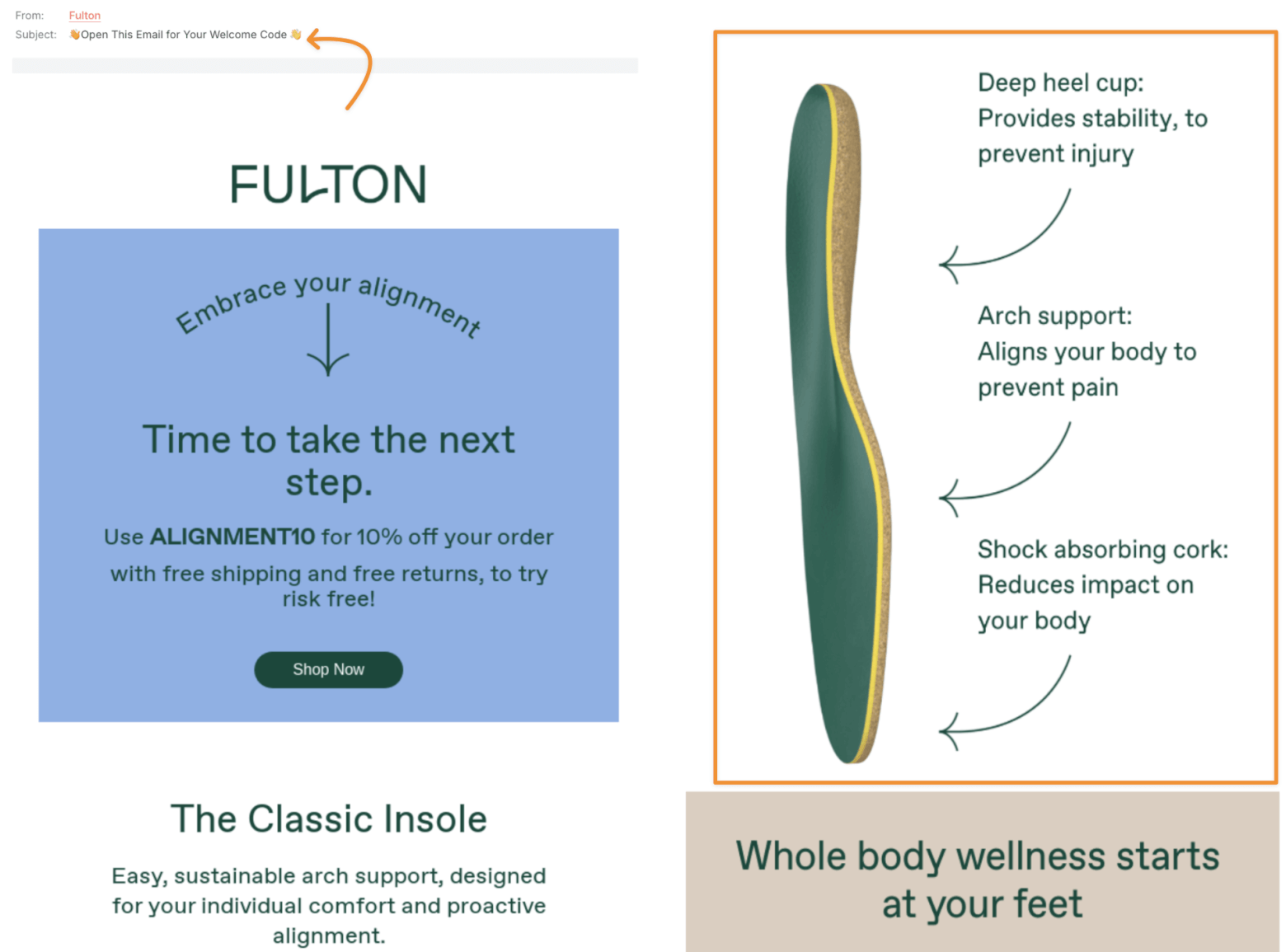
Source: Really Good Emails
Fulton’s welcome email makes an immediate impression with its vibrant color palette. It can make subscribers feel welcomed right away.
What you can borrow:
- A subject line that drives action. “Open This Email For Your Discount Code” beats the usual “Welcome to [Brand]” every time.
- A smart product spotlight. Their classic insole is featured in a clean infographic-style section, showing the thought and engineering behind it without getting too technical.
3. Vacation
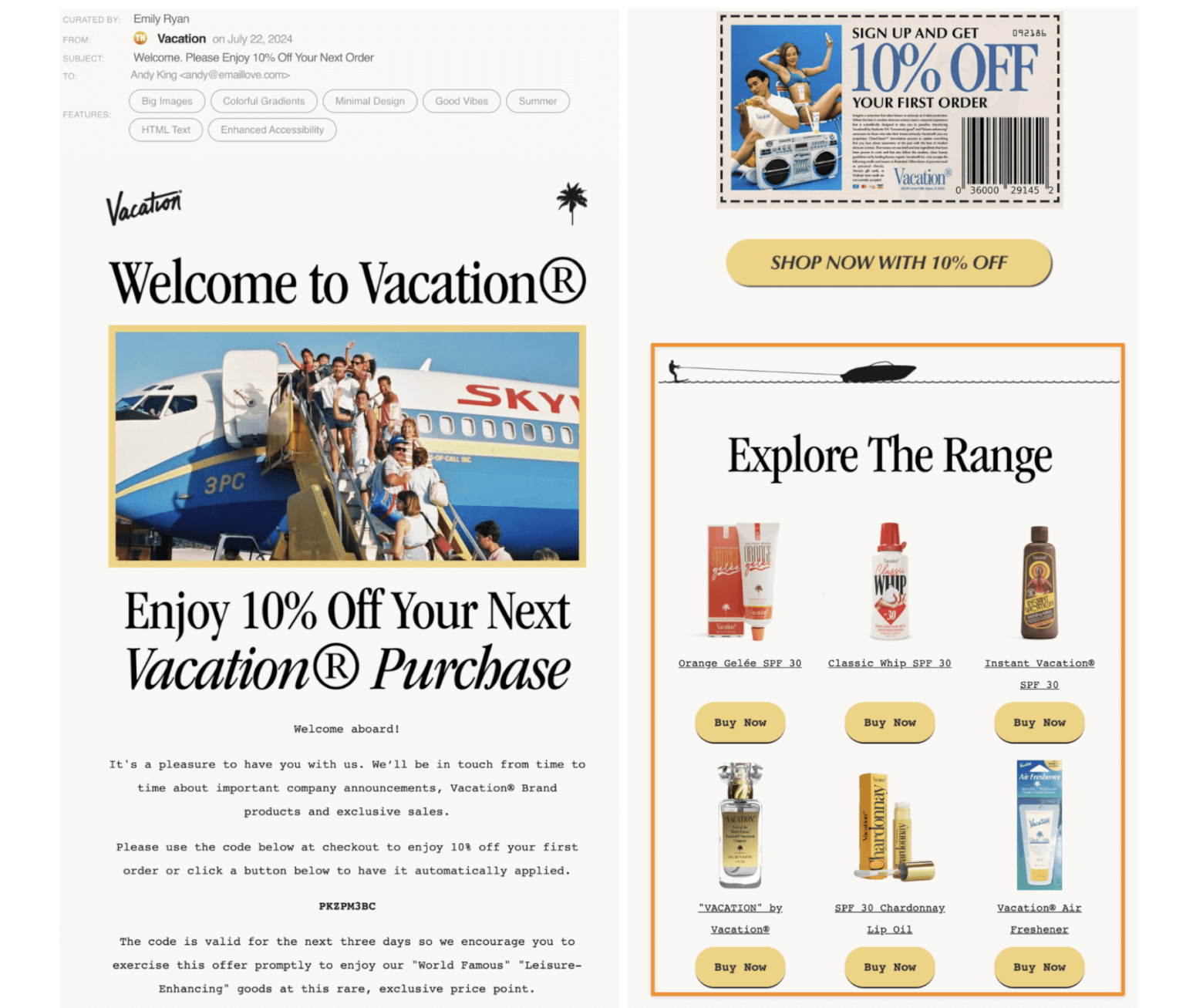
Source: Email Love
Sunscreen brand Vacation Inc. goes all out on brand personality, and it shows right away from email one.
What you can borrow:
- Unshakable brand identity. Everything from the colors to the tone screams Vacation in the 1980’s. This email will give anyone an idea of what the brand is all about.
- A shoppable product layout. Each item is paired with its own “Buy Now” button. You’ve probably read that marketing emails should have a max of 1 to 2 CTAs—but that depends on the goal. Here, it works because Vacation Inc is removing friction and making access effortless.
4. A Pup Above
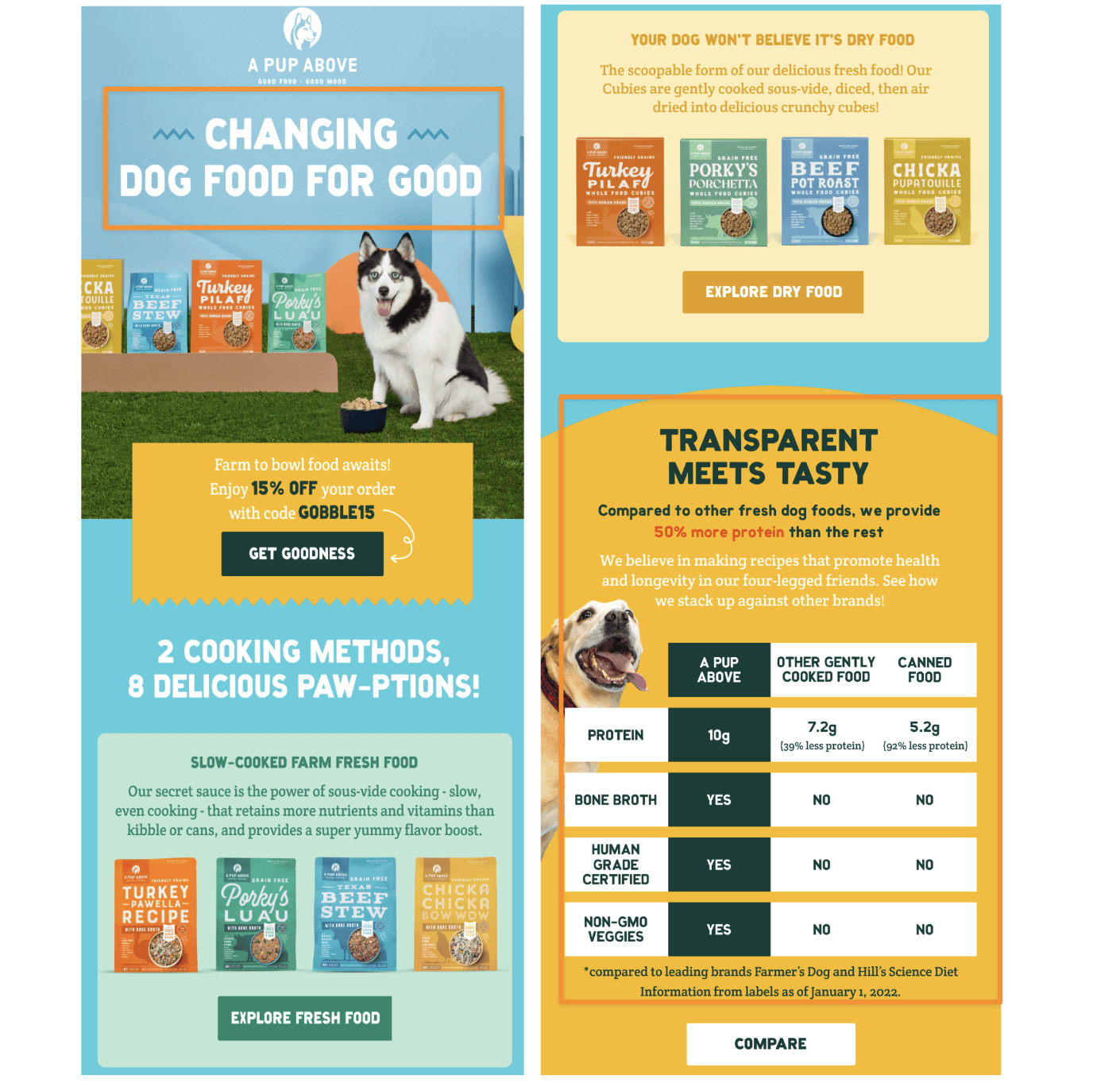
A Pup Above sells human-grade fresh dog food and dry kibble. While the adorable pup models help their welcome email, they’re *not* the entire reason this brand is on the list.
What you can borrow:
- Strong opening tagline. “Changing Dog Food For Good” is the first thing you see. It’s a meaningful way to attract and connect with dog lovers.
- Value-first comparison chart. It’s a simple, visual table that compares their food to others. It clearly outlines why their product is better (more protein, non-GMO, even human-edible), which is a great way to hook in new shoppers.
Note: If you want even more ideas to level up your strategy, check out our guide to DTC email marketing—packed with more examples, breakdowns, and tactics you can steal.
SaaS (Software-as-a-Service) and Other Platforms
SaaS, PaaS, and other -as-a-service platforms send welcome emails when someone signs up for a free trial or joins their list. These emails are usually quick, actionable, and geared toward getting the user to take their next step ASAP.
Here are the best welcome email examples to teach you how to maximize the limited space:
5. Zapier
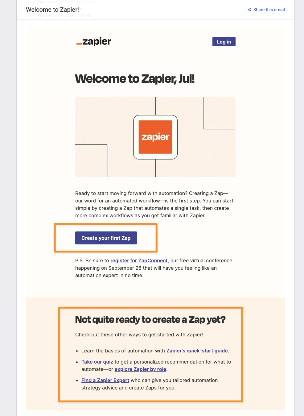
Zapier is an automation tool that helps users connect different apps. Their welcome email is clean, minimal, and straight to the point—which fits their no-frills, efficiency-first brand.
What you can borrow:
- A warm, personalized opening. It’s the first email in the list that addresses the recipient—me in this case—by name. Notice how it feels more than just a system-generated message. (Learn more about why personalization in welcome emails, and particularly in subject lines, is so effective!)
- Clear, relevant CTA. “Try it now,” “Start now,” and “Click here” are all overdone. “Create your first Zap,” on the other hand, is product-specific, active, and engaging.
- Helpful next-step alternatives. If someone’s not ready to dive in, Zapier gives them options: take a quiz, read a guide, or reach out to an expert. All framed as supportive, not pushy.
6. Airtable
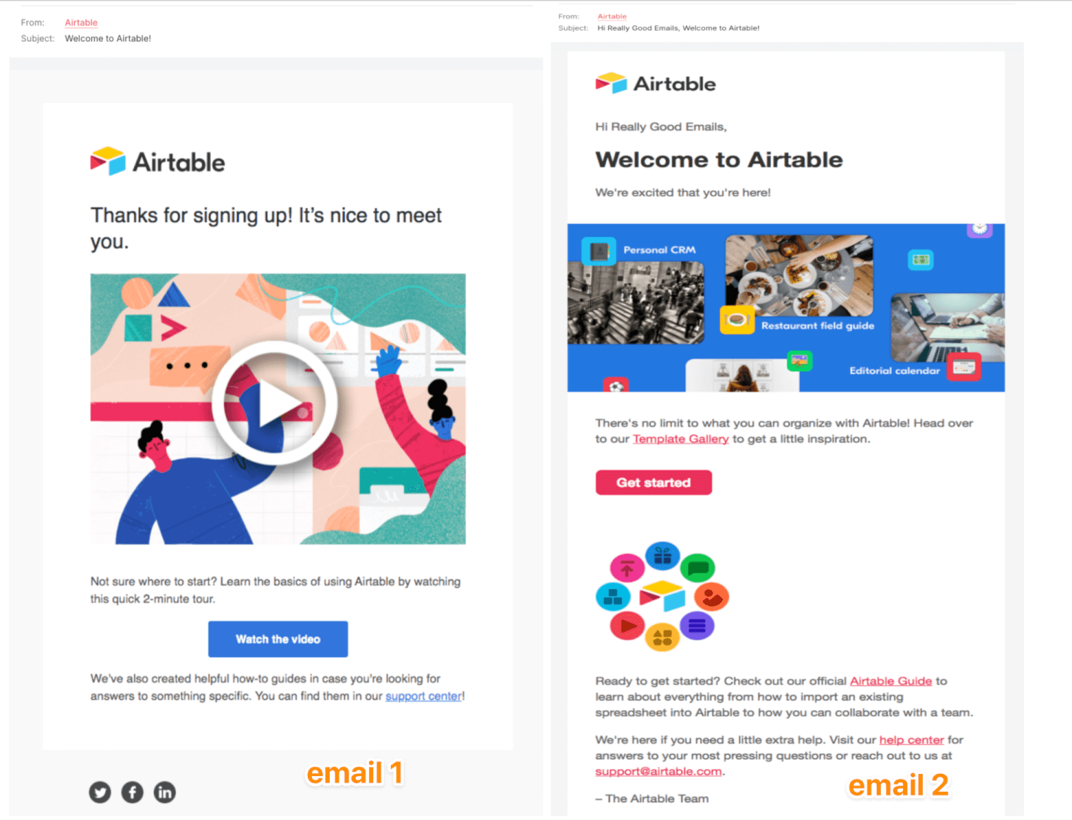
Source: Really Good Emails and Really Good Emails
These two short welcome email examples from Airtable prove that brevity works when done well.
What you can borrow:
- Clean and focused design. No clutter, straight to the point with a clear CTA. Sometimes, less is enough to move someone forward.
- A quick walkthrough video. Airtable practices “show, not tell” in their post-sign-up-slash-welcome email. It demonstrates how easy it is to use the tool in an accessible way.
- Action-based segmentation. Based on the two versions, we can assume that Airtable tailors its welcome flows based on user actions. One email goes to newsletter signups, the other to new product users.
7. Loom
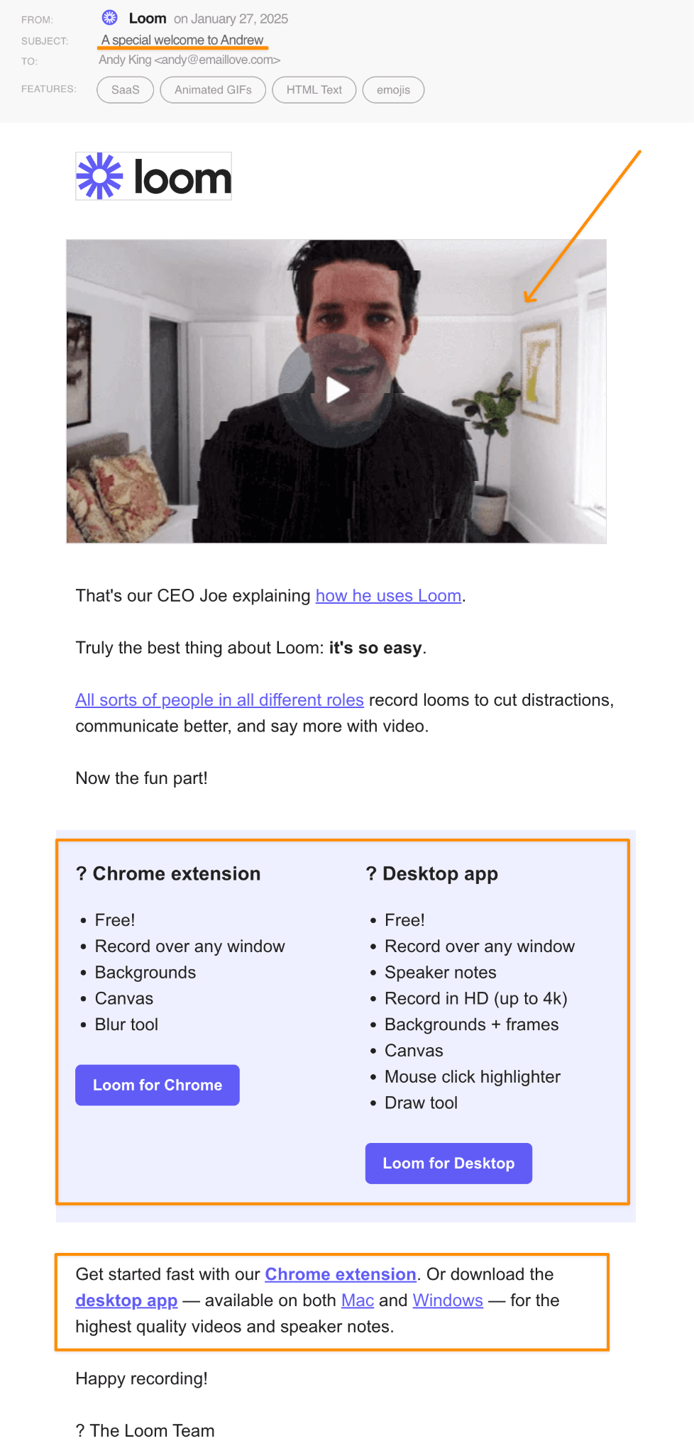
Source: Email Love
Loom takes the personalized human approach for their welcome email. Rather than simply sending instructions and next steps, they send a special greeting from the CEO himself.
What you can borrow:
- Founder-led intro for instant trust. Featuring a real person, especially the founder, builds credibility and creates an emotional connection from the get-go.
- Welcome video that doubles as a product demo. CEO Joe shares how he uses Loom. It’s a subtle way to teach users how they can get started. Talk about onboarding and email marketing storytelling rolled into one.
- Clear setup paths. The email lays out two options: install the Chrome extension or download the desktop app. Each is described with its benefits, guiding the user to the right path.
8. Mailboard
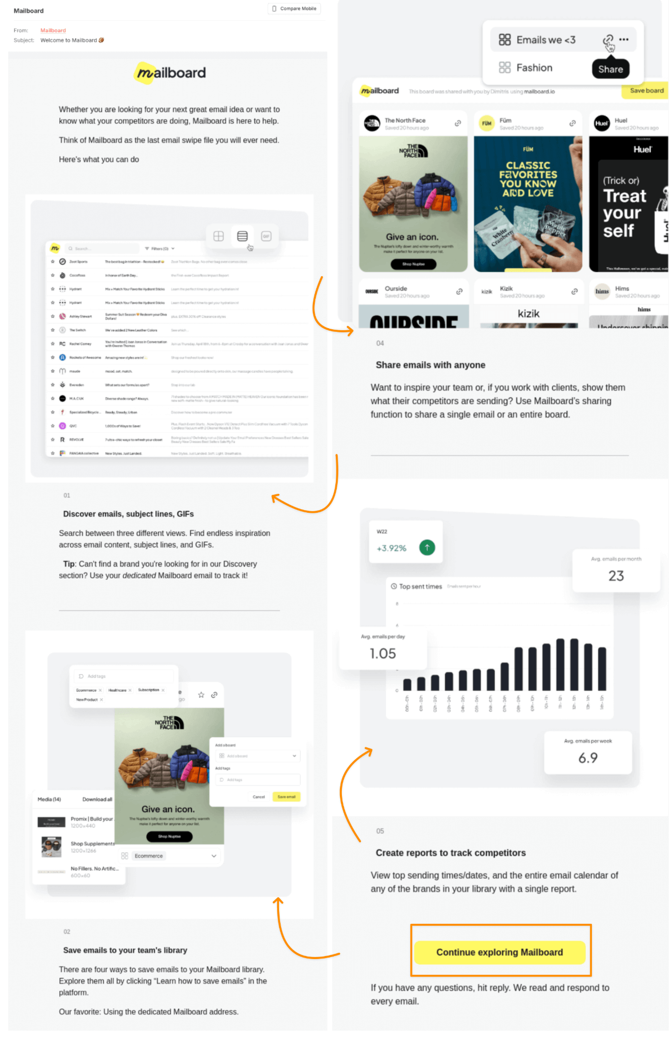
Source: Really Good Emails
Some SaaS welcome emails go long, and that’s fine if you design yours well. Mailboard, an email marketing research tool, takes advantage of the extra space to display their product.
What you can borrow:
- Instructional imagery. In-app sneak peeks paired with short explanations show users exactly what they’ll be able to do. They’re great for visual learners or first-time users.
- Single, well-placed CTA. Mailboard avoids clutter in this long email by guiding users toward a single action. Using strategic restraint helps keep focus and reduces decision fatigue.
Note: If you’re looking for more email marketing ideas to send to your users, this blog post is packed with them.
Media / Publishing
Because words are your thing, welcome emails in the media and publishing space are often text-heavy. However, that's precisely why they matter: they're your first shot at setting the tone and enticing people into tuning in every edition.
These welcome email examples will give you plenty of ideas:
9. Marketing Brew
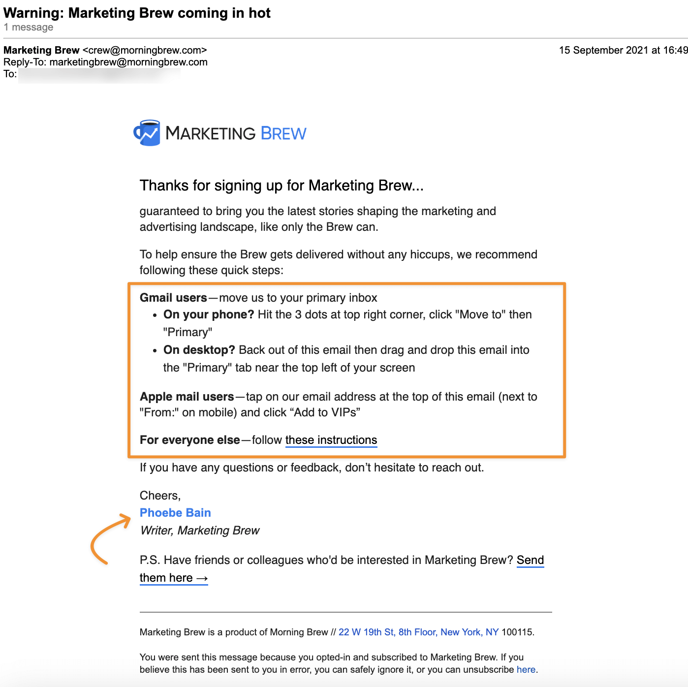
Marketing Brew publishes hot-off-the-press news roundups. Think of it as a daily industry report, but more digestible.
What you can borrow:
- Straight-up inbox housekeeping. They give you step-by-step instructions to make sure their emails land where they belong: your Primary tab.
- A personal sign-off that feels human. The writer, Phoebe, actually says hello and goodbye. It reads like it was written by a person, not an automated system, which is exactly what you want for building trust from email #1.
10. The CQ
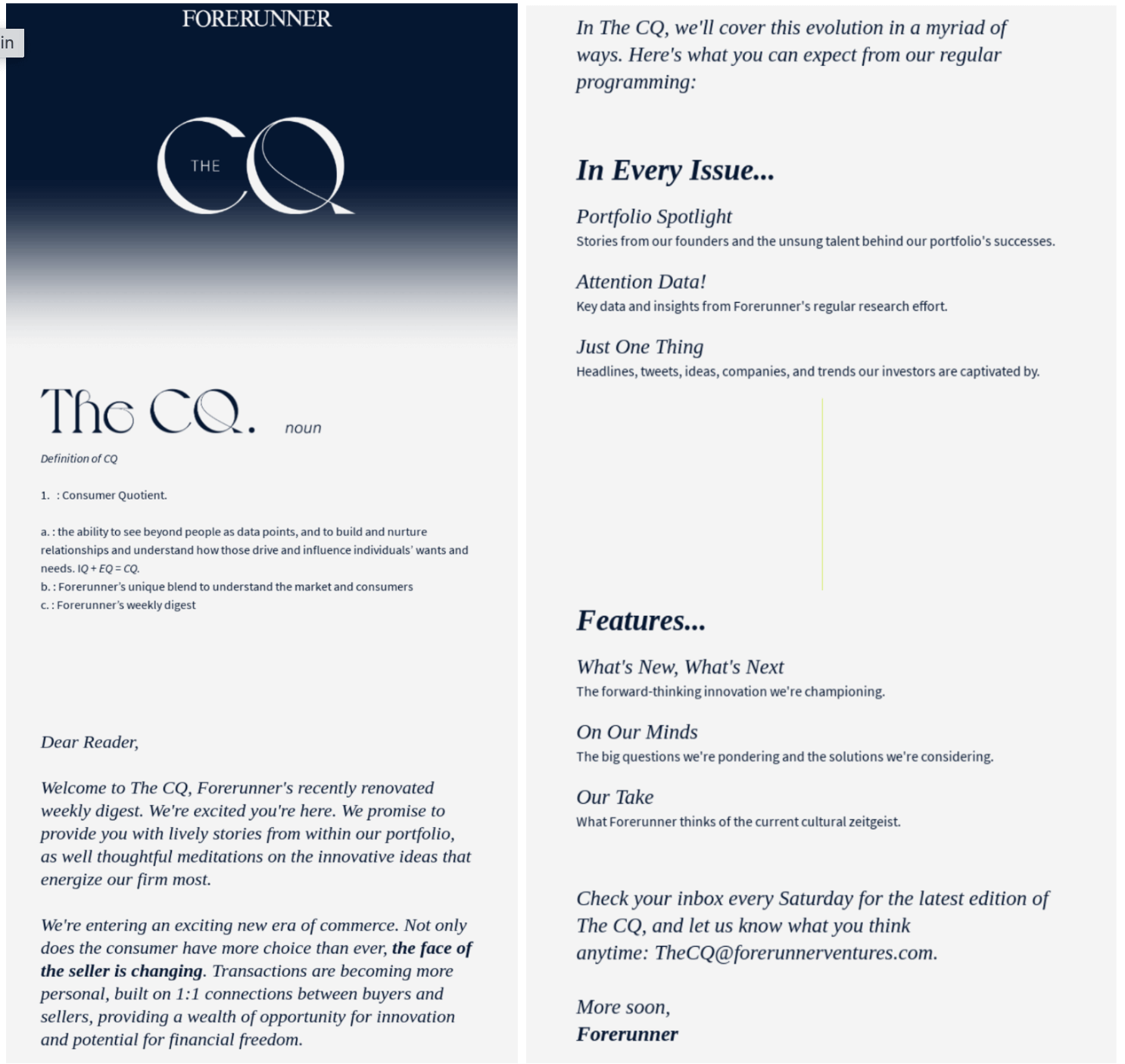
Source: Really Good Emails
The CQ (short for Consumer Quotient) is a Substack-powered newsletter focused on consumer behavior and marketing. It has over 15,000 subscribers and counting.
What you can borrow:
- Thoughtful layout design. Though it’s text-heavy, it doesn’t feel like a sea of text. The typography, line spacing, and margins all work together to make it scannable, light, and cohesive.
- Section previews. The email summarizes what each issue will include. It builds anticipation while setting new readers’ expectations even before the first edition hits their inbox.
Note: Need to spice up your newsletter? Here are some design tips and content ideas for you.
Apps
From banking apps to health and wellness apps… whatever category you fall into, you have one thing in common: sending a post-signup email that serves as a warm welcome.
Take note of the smart takeaways from these top app-based welcome email examples:
11. Revolut
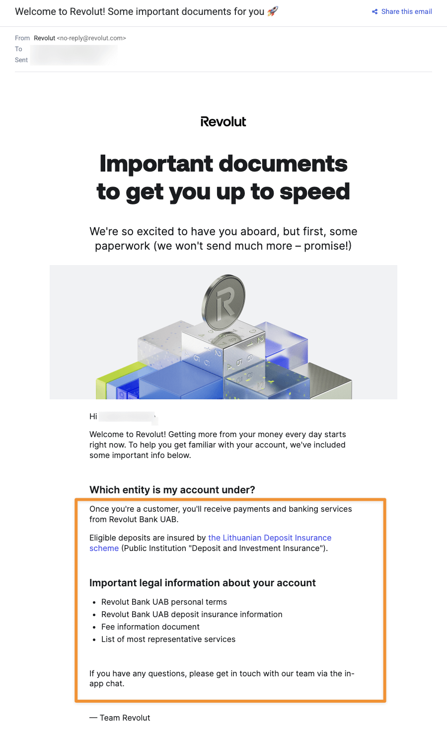
Revolut, a digital-first banking platform based in Lithuania, wastes no time showing you what they value most: security and clarity.
What you can borrow:
- A quick explainer upfront. Instead of bombarding you with banking jargon, they open with a clean explanation of what you just signed up for, followed by bullet-format essentials. That's a smart move in any high-risk or regulated industry.
- PDF attachments for onboarding. Not seen in the image above, but Revolut’s welcome email includes downloadable documents, like privacy policies or T&Cs. It shows users that you care about transparency, without cluttering that first email they receive from you.
12. Headspace
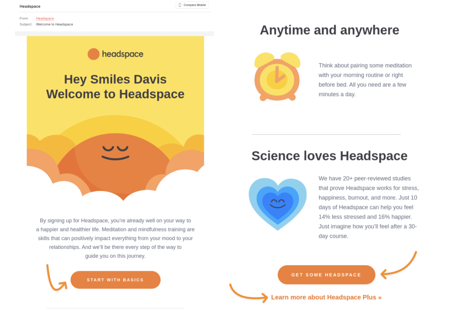
Source: Really Good Emails
Headspace is one of the most user-friendly meditation and mindfulness apps. Their logo, color palette, and signature illustrations are instantly recognizable. You see them right away when you sign up for a paid account or a free trial.
What you can borrow:
- On-brand, feel-good copy. The text sounds exactly like the experience they want you to have when using the app: relaxed and supportive. Plus, it reflects one of Headspace’s core promises—making mindfulness accessible, no matter how packed your day is. It’s a good way to advertise without being pushy.
- Smart, relevant CTAs. There’s a next step for everyone: jump into the Basics course, download or visit the app, or upgrade your membership. These CTAs guide users based on where they are.
Education / eLearning
For schools and online learning platforms, a welcome email is a direct response to expressed interest or an inquiry. It’s the first step in what should feel like a thoughtful, ongoing conversation, not a sales pitch.
13. Harbour.Space
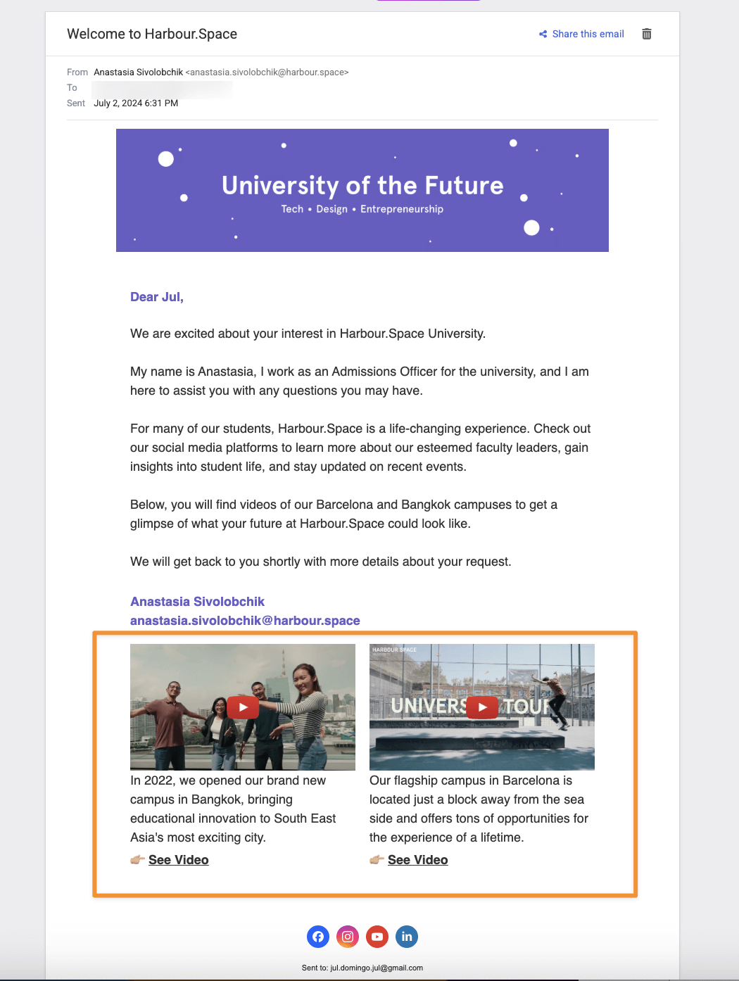
Harbour.Space is a design-meets-tech university offering master’s programs in marketing, technology, and entrepreneurship. Their welcome email differs from other educational institutions for one key factor.
What you can borrow:
- Non-aggressive, student-first messaging. Unlike many emails from the admission office that go straight into “Apply now!” mode, Harbour.Space eases in. The copy focuses on why they might be a great fit, touching on the campus culture and what your learning experience could look like.
14. Duolingo
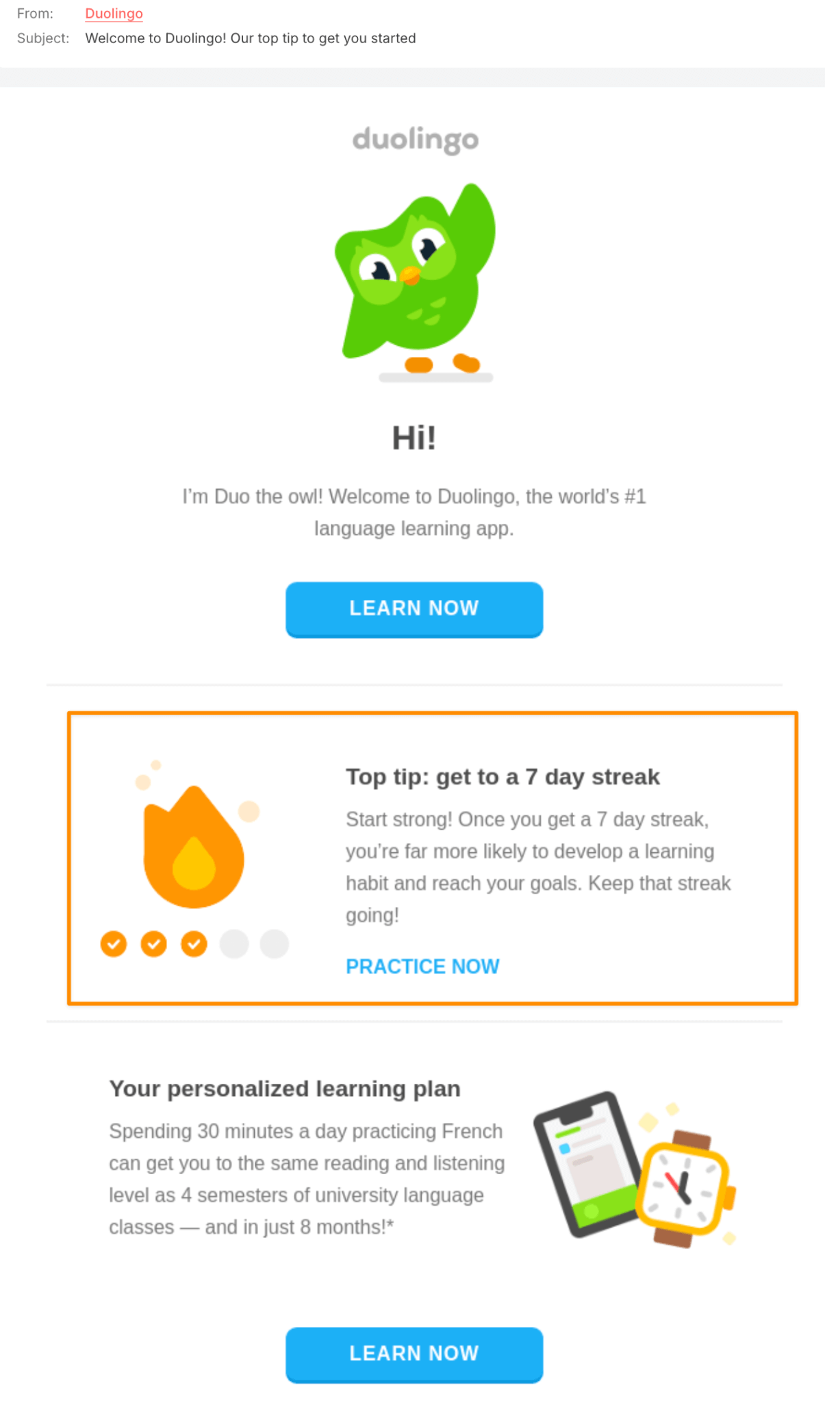
Email source: Really Good Emails
The viral green owl himself keeps things warm, welcoming, and motivational in Duolingo’s welcome email. It’s concise and focused on one thing: helping users actually start learning.
What you can borrow:
- A simple, actionable tip. If someone signs up to learn something new, give them a little push in the right direction. Duolingo highlights the power of building a 7-day streak—an easy, manageable challenge that gives users a goal, a sense of progress, and a reason to keep showing up.
- Low-pressure encouragement. The tone is friendly and cheerleader-y without being overbearing. If you’re in the field of education, your welcome should inform and inspire. Don’t put pressure on the learner.
Service-focused brands
Since service-focused brands, especially those in the hospitality industry, are all about delivering a feeling, their welcome emails should reflect the experience they want customers to have.
Let’s take a look at how brands across these industries design theirs:
15. Etihad
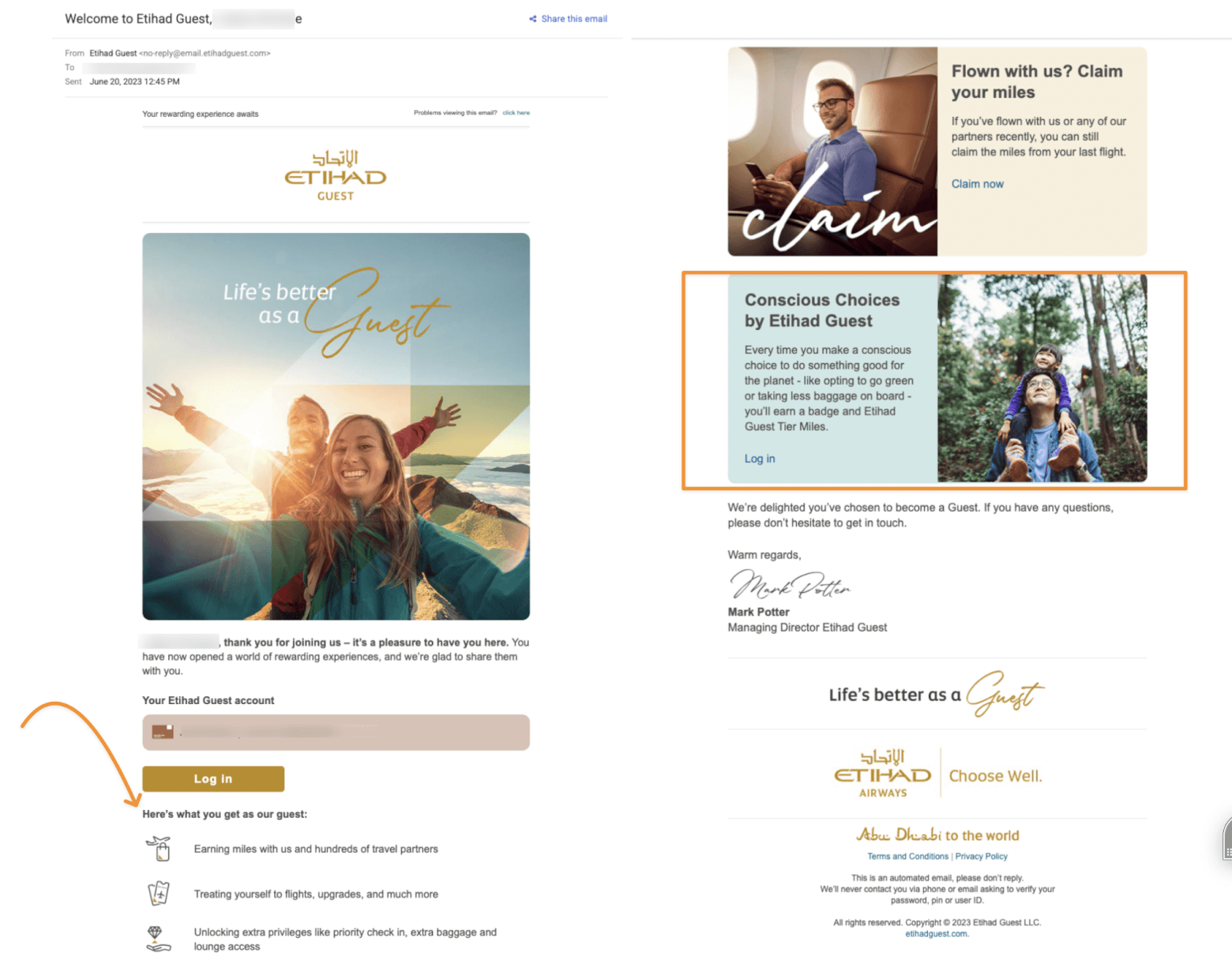
Upon joining Etihad Guest, the airline's loyalty program, they’ll send you a warm welcome that gives you the full rundown of your new member benefits.
What you can borrow:
- Unique selling proposition on full-display. Aside from the obvious perks like mile points and extra privileges, Etihad dedicates space to highlight its sustainability initiatives. When guests choose eco-friendly travel options, they’ll be rewarded for it. This little move boosts the brand's image as a responsible, future-focused airline.
16. Jacumba Hotel
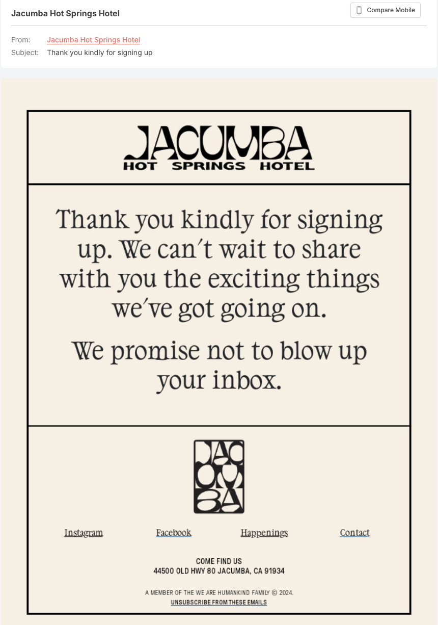
Source: Really Good Emails
Jacumba hotel is an artisanal boutique hotel tucked in Southern California. Their welcome email does a wonderful job blending their digital and real-world experience, which is a must for hospitality brands.
What you can borrow:
- Visual and brand alignment. It may be the shortest welcome email example on the list, but with clever stylistic choices, Jacumba manages to emulate what their website looks like: stylish, minimal, a little bit nostalgic.
- Witty promise: It’s also likely the most straightforward welcome email example. Just a warm thank you and a sweet little promise not to clog your inbox with anything unnecessary.
Nonprofits / Advocacy
Nonprofits need to establish rapport with their supporters, whether they’re donors, volunteers, or just interested community members. So for the final welcome email example, let’s look at one that knows how to connect emotionally, fast:
17. Charity: Water
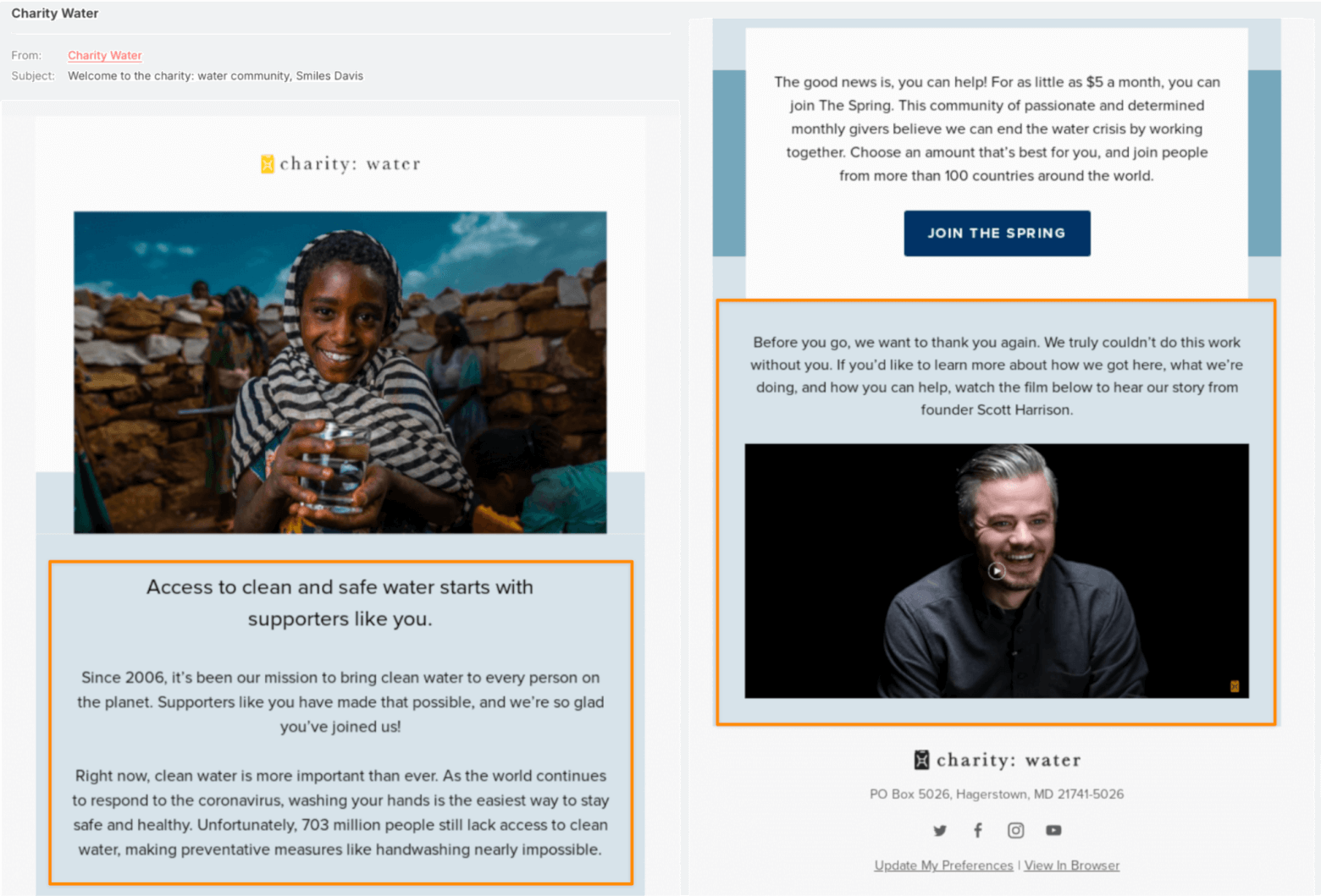
Source: Really Good Emails
Charity: Water is a nonprofit that provides clean drinking water to developing countries. They don't waste time in their welcome email, immediately emphasizing their mission and evoking raw emotions from the start.
What you can borrow:
- A powerful, story-driven video. The film-style video shares the founder Scott’s personal story, showing why he started the organization. Lesson here? If your cause is human-centered, lead with the human story.
- A direct, humble ask. They mention that even $5 can make a difference. It’s a clear, specific, and accessible request, which is enough to turn interest into action.
Welcome and Win ‘Em Over with These Best Welcome Emails Examples
That wraps up our list of the best welcome email examples. Borrow the elements that make sense for your business, and reap the benefits of providing a one-of-a-kind email onboarding moment.
What’s next?
- Fine-tune the first thing your subscribers see with this guide on welcome email subject lines.
- Or explore other automated emails you can set up for better email marketing results.
The authors
Learn more about us

We keep our content up to date
28 May 2026 - Added video
Our Methodology
This article has been written and researched following our EmailTooltester methodology.
Our Methodology