Sending a regular newsletter to your subscribers can be incredibily rewarding, as it comes with many benefits. But designing a newsletter can feel tricky and overwhelming!
New features and technology become available every day, and with so many email services and newsletter tools out there, it's hard to keep up with changing trends. And if you don’t keep pace, your subscribers might start to notice your emails don’t seem as “modern” as others.
To help you stay ahead of the curve (without the guesswork), we’re sharing everything you need to design an email newsletter that shines in 2026.
In this guide, we discuss the essential visual elements any good email newsletter needs, then explain how to design those parts perfectly. We’ll also share some expert tips on designing a newsletter and address the issue of designing for different screen sizes and apps.
How to Design An Email Newsletter: 5 Essential Components
What makes a great email newsletter? First off, it should match your audience and industry. If you’re mainly sharing educational content, a simple, text-only format might actually work best—no need to worry too much about visuals when the writing is doing all the heavy lifting (and where your main focus will be writing the newsletter content).
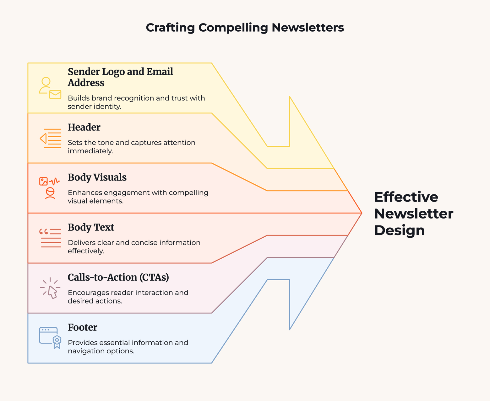
But if you’re in an industry that relies on eye-catching newsletters to stand out, your email newsletter design should include these 6 aspects in one way or another:
- Sender Logo and Email Address
- Header
- Body Visuals
- Body Text
- Calls-to-Action (CTAs)
- Footer
You can use this as a checklist when you first start designing your next newsletter. However, knowing what you need is not enough – you also need to know how to design each part. Let’s take a closer look at each area, including the best practices for designing them by 2026 standards.
1. Add a Sender Logo and Use a Trustworthy Email Address
Creating a positive impression starts even before an email is opened. You can achieve this by incorporating a sender logo.
Here is what our (animated) sender logo looks like:
![]()
Currently, there are two different methods for setting up sender logos, but neither is universally compatible with all email providers. However, there's good news for Gmail and Google Workspace (by far the most used inboxes): there's an easy way to set up an animated logo. Just follow the instructions in our detailed guide.
For Yahoo Mail and Apple users, you'll need to add a BIMI record to your domain settings. You can find more details on this in our guide to email authentication.
Alongside the sender logo and name, the email address is also displayed. It's crucial to ensure that your email address appears trustworthy and adheres to best practices.
2. Make Newsletters Headers Eye-Catching
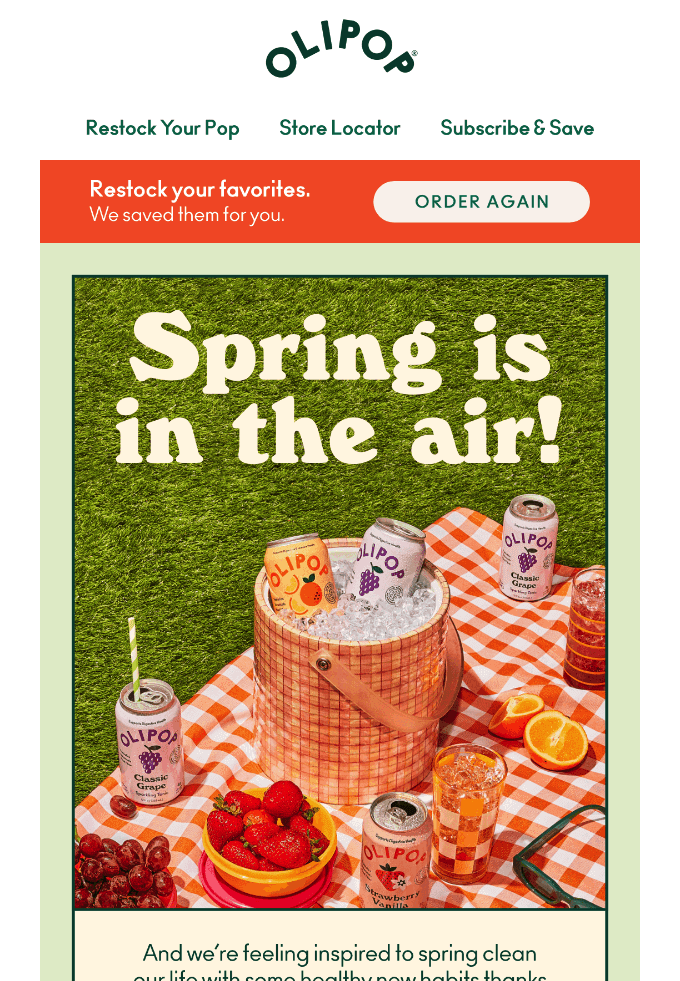
Source: Olipop (ReallyGoodEmails)
Your email newsletter header is simply the part at the top. It’s the first thing readers see after they open your email, which makes it valuable real estate. That’s why a lot of brands use the header for their logo and/or menu links.
Now that your reader has actually opened the email, it’s time to prioritize visuals. You want to dazzle your reader with something that looks good, and the header sets the tone for the rest of the newsletter. Use something eye-catching here. Your logo is a good choice for both visuals and branding, not to mention it reminds your reader whom the email is from.
To help your header look its best, remember to stay minimal. Don’t try to cram too many links, images, or colors in there. Removing clutter also removes distractions, and gives the parts that remain space to breathe. In our email newsletter design example above, you can see that Olipop keeps it very simple with only three links, a plain font, and for visuals only their logo — itself very simple.
It’s also a good idea to keep the header the same in all newsletters. Of course you can update it from time to time, but in general it’s better to stay consistent so that the reader learns to instantly recognize it after a few emails.
3. Use Visual Hierarchy When Designing the Newsletter Body
Now onto the main course: the visuals in your newsletter body. This is the content your readers want to see, whether to get news, learn details about a promotion, or even shop. However, unlike the other parts of designing a newsletter, this one is very open-ended.
Before we get into the details, here’s a quick warning: some users disable images in their emails, so keep that in mind when designing. You might want to have secondary text options that reiterate your message, so those without visuals still get the idea.
What content you use depends on your business and audience, although when it comes to organizing and displaying this content, there are a few tried-and-true methods that work for everyone.
First, you want to approach designing a newsletter just like designing a web page. The two have similar design concerns and goals, such as moving visitors forward through the conversion funnel. Just like designing a web page, focus on visual hierarchy and visual flow.
If you’re unfamiliar with these terms, they refer to using graphic design strategies like size, color, shape, typography, and empty space to get some parts of your layout noticed before others (like having your calls-to-action stand out, but not your legal information). You can read more about visual hierarchy for email layouts here.
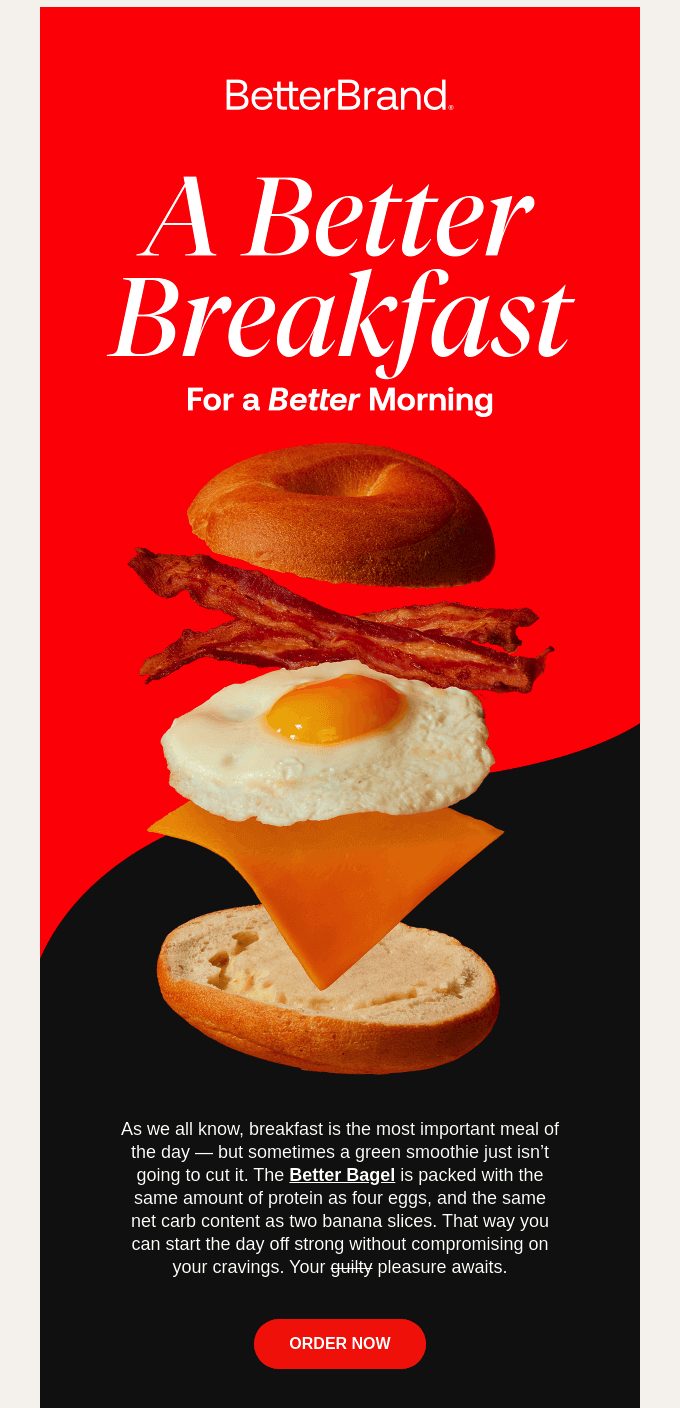
Source: BetterBrand (ReallyGoodEmails)
In our email newsletter example above from food tech company BetterBrand, notice how each part of the bagel sandwich either touches or is close to the next one? This design utilizes visual hierarchy and flow to draw the reader's eye downward, rather than skimming left-and-right which is most people’s first instinct.
At the same time, you want to use ample empty space, also known as “white space.” In design, empty space is the parts of the composition that don’t have anything in them — the blank parts. Using empty space not only avoids distractions, it also draws attention to the visuals that are there, giving you more control over what your reader sees.
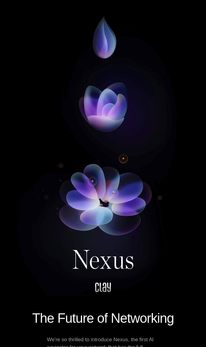
Source: Clay (ReallyGoodEmails)
Relationship software company Clay uses both visual hierarchy and empty space really well in its email newsletter example. The focus goes from drop to bud to flower in a vertical chain, with plenty of empty space on the sides so the reader stays focused on the main visuals.
In terms of creative choices like color and typography, it’s best to stick with your branding elements. Chances are, your company has already chosen the optimal colors, fonts, and tone of voice to suit your audience, and reusing these same elements strengthens their associations with readers. In other words, when your readers see those elements, they’ll think of you.
To that end, be sure to include your logo somewhere in the email. If not in the header or footer, put it somewhere creative in the body layout.
Last, you may already know to use high-resolution visuals, but you also should optimize or compress images. Just like web pages, data-heavy assets make loading times unbearable, especially for emails. Be sure to compress those images to reduce the file size before adding them.
4. Use Text to Support the Visuals
Peppered throughout the visuals of email newsletter design is the newsletter copy. This text plays a supporting role in your layout, but one that is ultimately necessary for sharing information.
Like with other parts of designing a newsletter, for text, less is more. Rely more on your visuals, and use text only for what is necessary. When you have something to say, say it in as few words as possible.
And because visuals are so important, pay close attention to typography. Your fonts, text sizes, and style effects like bold or italics, are all visual choices. Make these decisions based on both your audience’s preferences and your branding, or how you want your company to come across.
For example, fonts with serifs — those little tags on some letters — are seen as more formal and professional, whereas those without serifs (sans serif) are more casual and friendly. Pick the one that best represents what you want your brand to be.
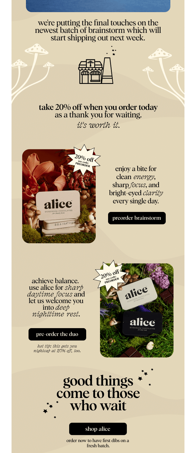
Source: Alice (ReallyGoodEmails)
In the email newsletter example above from mushroom chocolate brand Alice, notice how they use italics. For one thing, these make key features and selling points stand out, but moreover, they also make the email look better. Line after line of text can be daunting to readers, so using heavy italics can make it appear more interesting.
5. Make CTAs Stand Out
In many ways, the CTA, or call-to-action, is the main reason you send email newsletters. The CTA is the button or link that directs readers to where you want them to go, whether a product page, social media profile, signup page, or wherever else fits your marketing strategy.
There’s a lot to be said about crafting an effective CTA, but for now we’ll focus only on the visual design. The main point to remember is to make your CTA the most prominent part of your email newsletter.
Visually, you want your CTA to stand out so that your reader notices it, but also to make it more enticing. The more readers glance at your CTA, the more likely they are to click it. That’s why email newsletter CTAs are usually buttons set apart from the rest of the layout, although text-only CTAs can also work in certain conditions.
Specifically, use design techniques with contrast on CTAs. The most common strategy is to use color contrast: making your CTA button the opposite color of the background, like black and white, or blue and yellow. Size contrast also works, for example, making your CTA button larger than the elements around it.
You also should avoid competing CTAs by sticking with only one or two going to the same place. This way, you can really focus your efforts on one goal instead of splitting your audiences. If you want to promote two different links at once, you can always send a second newsletter.
Some newsletters are designed like a catalog or table of contents, with different links to different sections, depending on the reader’s interest. That’s fine, but for all other types of CTAs, it’s best to have only one CTA that draws the most attention.
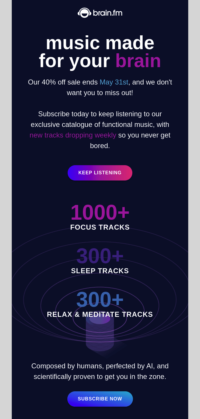
Source: Brain.fm (ReallyGoodEmails)
What do you notice first about the Brain.fm email? The pink gradient CTA near the top sticks out wonderfully against the dark blue background, as does the second light blue CTA near the bottom.
As for the wording and other marketing techniques like adding urgency, read our email CTA best practices here.
6. Let Footers Take a Back Seat
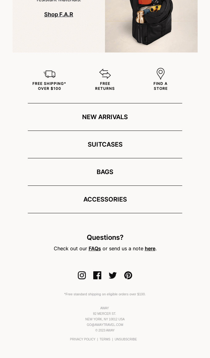
Source: AWAY (ReallyGoodEmails)
If the CTA is the most prominent part of a good email newsletter design, the footer is the least prominent part. Aside from social media icons, the footer is where you stick the parts that are either mandatory, like the unsubscribe button and legal disclaimers, or generally helpful, like a business address.
What you put in the footers should be “out of the way.” You want your readers to focus on the body of the newsletter, so design your footer to blend in and be inconspicuous. Specifically, common strategies include using a lighter color like gray for the text and reducing the size.
Some companies use the footer as a navigation bar, where they place links to all pages on their website, including less popular ones like the About or Contact pages. Because the footer is designed to be out of the way, those links shouldn’t compete with your main CTA.
7 Other Elements to Consider When Designing a Newsletter
We’ve talked about the key visual elements of an email newsletter, but of course, that’s only part of the puzzle. When designing your newsletter, these tips are just as important to keep in mind:
1. Design Newsletters for Different Screen Sizes and Apps
Because email newsletters rely so heavily on visuals, you want to make sure that your newsletter displays correctly, no matter where it’s seen.
While a lot of people still use desktop for emails, nearly 50% of emails are opened on mobile devices. Considering the multitude of different phones and screen sizes, you have to be extra careful to design a newsletter that looks good on all of them.
For one thing, stick to a single-column layout. Using two columns may have its advantages, but it’s too risky on certain screen sizes. There’s a chance part of the email might get cut off and force the reader to scroll horizontally and vertically, which can be annoying. With responsive designs that adapt to different screen sizes, thinner is better.
Likewise, you also want to make sure your text is large enough to be seen, even on the smallest screens. Body text should be over 13pt, while titles should be over 20pt. This will keep your text legible no matter where it's read.
Also, don’t forget that mobile devices use touch controls, so that affects interactivity a little differently than desktop versions. Specifically, make your links large enough to be tapped — especially your CTAs.
If you’re worried about responsive designs, or if your subscribers have an especially wide range of different phones, feel free to use a template. Our list of free newsletter templates are all responsive, so you can pick one you like and rest easy.
2. Craft a Newsletter Subject Line That Sets the Scene
As the gatekeeper for opening an email, the subject line is arguably the most important part of your email newsletter design. A good subject line will get your newsletter opened right away and enthusiastically; a bad subject line will get it deleted and perhaps even unsubscribed.
First and foremost, be concise. Your subject line is going to be buried among many others, and readers tend to scan subject lines quickly to determine which emails get read. That’s why you want to say something enticing in as few words as possible, and in clear language.
Ideally, aim for around 7 words or 41 characters. This area fits in the preview of most email apps, so you don’t have to worry about it getting cut off.
Another tip is to use proactive language, i.e., command sentences starting with a verb. For example, instead of saying a statement like “You can get this discount now,” rephrase it as a command like “Get this discount now.”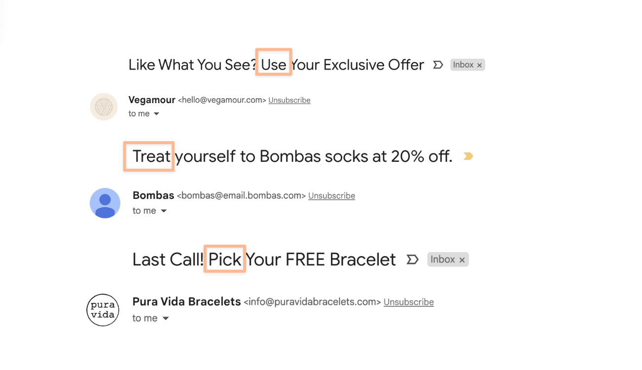
Proactive language tends to have a positive effect on conversions, suggesting the next move for people unsure of what to do. It also cuts down the word count, keeping your subject lines short and sweet.
As long as you’re not a formal or traditional brand, you can also experiment with visual elements like emojis. For certain audiences, emojis make otherwise boring emails more fun and casual, mimicking an email subject from a friend. At least, that’s what our own email A/B testing showed us. Likewise, you can also test light slang (just for the lolz) in subjects to see if it strikes a chord with your audience.
You can also personalize your subject lines with the reader’s name, location, or other information specific to them. As detailed in our study on email marketing statistics, personalization can increase open rates by about 3% and click-through rates by around 0.5%. In large-volume email campaigns, those bumps can make a big difference.
The standard approach to personalization is adding the reader’s name to the subject line, but you can get more creative than that. A personalized subject line can mention the reader’s location, job title, or company, as well as discussing their personal interests. Read our guide to email personalization for more direct tips.
Furthermore, if you want to preview how your subject line appears on a variety of phone screens and apps, check out our free subject line tester tool. Here you can see mockups of what any subject line you enter will look like on different screens.
3. Use Newsletter Preheaders to Support the Subject Line
Sometimes called the email snippet text or email preview text, the preheader is that little teaser for the email that comes after the subject line in most email inboxes. The preheader is like the sidekick of the subject line; it serves the same goal — enticing people to open the email — but doesn’t carry the same weight.
Still, it’s best to optimize both the subject line and preheader to get the most opens, click throughs, and conversions. The best strategy is to add extra incentive in the preheader that you couldn’t fit in the subject line, such as additional details or even a hook to engage the reader.
Just like the subject line, you want to keep this short and to the point. In that vein, limit your preheader to between 40 and 100 characters – the shorter the better!
4. Choose the Right Email Tool
Your newsletter design is only as good as the tools you use to build it. That’s why it’s important to make sure you have the right email marketing software straight off the bat.
When it comes to email design, some tools are better than others. Design features vary depending on which service you use, so you first need to figure out how invested you are in design freedom. If you want full control over designs, you’ll need a tool with lots of customization options. If you’re comfortable with the restrictions of template designs, you won’t need those advanced design features.
If you’re not familiar with what’s on the market, you can read our comparison guide to email marketing services, which highlight each platform’s advantages and disadvantages to help you choose.
5. Take Advantage of Templates (and AI)
Don’t feel obligated to design an original newsletter from scratch — there’s no shame in using email newsletter templates. Like boilerplates, email templates usually provide a fill-in-the-blanks style of design that lets you add your original content to pre-existing visuals.
Emails made by templates don’t feel unique, and sometimes they run the risk of having that cookie-cutter look, like you’ve seen it before. However, visual design isn’t for everybody; if you’re struggling to think of good ideas or understand visual hierarchy, using templates makes sense.
Just remember that not all templates are the same quality. Try to find a reliable template that looks modern and matches your branding style. Feel free to browse our list of free newsletter templates, which lays out the best places to find the kind of free template you’re looking for.
Some email marketing platforms now also offer AI-powered tools that can generate an entire newsletter design from scratch, but in our experience, these also tend to look a little generic. If you are going to use these, make sure they use your branding (colors, logos, fonts) and are consistent with the aesthetic of your website and social profiles.
If you’d like to try designing yourself, but want some “training wheels” on your first few designs, check out our list of email template builders. Many of these builders come with customizable templates, a good compromise between using a fill-in-the-blanks template and designing an email from scratch. And there are even some that provide AMP for Email features that let you add forms and other interactive elements to your newsletters.
6. Adhere to Accessibility Guidelines
Adhering to accessibility guidelines allows your email to be enjoyed by anybody, and even enables compatibility with certain devices like screen readers or voice controls, used by those with disabilities. These are important to avoid alienating some customers, and instead making them feel perfectly welcome.
Specifically, you want to make sure your email newsletter is readable by anyone. Mistakes like using small fonts, or using text in images, make your email hard to read for people with impaired vision. That’s why you should pay close attention not only to font sizes, but also the color contrast between your text and the background. You want adequate contrast so that the letters stand out; otherwise, they might blend in too much, making it hard to read for some people.
Even more practical, use alt text for all your images. Sometimes called alt tags or alt descriptions, alt text are written descriptions of what the image displays; they’re used by screen-readers for people who can’t see the images.
7. Use A/B Testing to Optimize Each Part
Guessing what works is never as successful as actually knowing. The question is, how can you know the results for sure before you do it?
The most reliable answer is email A/B testing. In an email A/B test, you show people different versions of your email and see which one they like better. If you’re using a good email marketing service, you can even narrow down the test-takers to your target audience’s demographics and psychographics.
Basically, you can design two different email newsletter layouts, show them to people like your target audience, and analyze their performance to determine which one is better. But the beauty of A/B testing is that you can test each individual variable. So you can also use A/B testing to decide between two different subject lines, preheaders, CTAs, and even the sender name on the email account.
All of this can help you find the ideal combination of design elements that will appeal to your audience most – and lead to the most conversions.
Wrapping up: How to Design an Email Newsletter
One of the problems many small- and medium-sized business owners face is that they’re usually not designers. And when you’re just starting out or restricted by a tight budget, hiring a professional designer isn’t always an option — but neither is sending out sloppy-looking emails!
Email marketing is one of the most effective sales strategies of today. Nearly everyone on the planet has an email address, and reaching out to them is a direct and personal connection that can quickly turn them into a loyal customer. You don’t want to give up on this lucrative marketing approach just because you’re not confident in designing a newsletter.
As we mentioned above, you can always use templates. If you’ve chosen a worthwhile source for your templates, you can have a professionally designed email at a fraction of the cost. The best templates use cutting edge design techniques to give them a modern look and feel. The downside is a lack of originality, but that’s still better than a sloppy newsletter design — or no newsletter at all.
If you ever need help crafting an email newsletter, you can always check our other articles for advice. A good place to start is our all-encompassing guide on how to create an email newsletter, which covers everything from email software to legal considerations to getting more subscribers.
We have articles on any number of topics, from the beginner basics to more advanced strategies. For more advanced advice, read our article on the best times to send newsletters.
Still stuck for ideas? Check out our list of the best email marketing libraries to inspire your next campaign!
Let us know in the comments below if you have any specific questions about designing a newsletter!
Email Marketing Ebook: Beginner's Guide
Sign up to receive your free copy and avoid common mistakes!
The authors
Learn more about us
We keep our content up to date
16 Apr 2025 – General update
24 Jan 2024 – Updates related to the sender logo and email address
Our Methodology
This article has been written and researched following our EmailTooltester methodology.
Our Methodology