Being a self-proclaimed professional newsletter subscriber – with a special email address set up to keep tabs on my growing collection – I’ve seen my fair share of subscription forms.
Here’s what I realized: many brands and organizations assume a basic form will suffice.
They focus on the landing page. Or launch into brainstorming email content. Meanwhile, designing a newsletter signup form often takes a backseat.
But a signup form is the gateway to successful email campaigns and newsletters. It holds the key to growing your mailing list.
In this article, we’ll look at ways you can leverage this little box to capture prospective readers' attention and give them a taste of what’s to come. We'll share 19 conversion-friendly newsletter sign up examples, and the best practices behind them.
But first, let's discuss how crafting it well will benefit you.
What is A Newsletter Signup Form, and What are Its Benefits?
A newsletter signup form provides a space on your website to collect visitors' personal information, such as their names and emails. By collecting these details, you can send them relevant messages (such as newsletters and marketing emails) and maintain a strong brand presence.
Here’s what you’ll reap if you design it right:
- Improved Conversion Rates: You're more likely to get people to sign up if your form is visually appealing and easy to navigate.
- Smoother Form-Filling Process: Thoughtful design elements, such as clear fonts and simple fields, enhance user experience.
- Enhanced Brand Recognition: Aligning the form's colors, fonts, and overall design with your brand identity contributes to better brand recall.
- Enhanced Trust and Credibility: Including security badges and a privacy statement assures new email subscribers that their information will be handled securely.
- Better Segmentation: Additional sign-up form fields, such as location and birth date, can improve campaign targeting.
With all these benefits, you probably wish most – if not all – of your website traffic would turn into subscriptions. While that’s a big ask, crafting an effective newsletter subscription form can help you maximize your chances.
So, if you’re looking to revamp your newsletter sign-up form or learn how to build one from scratch, take a look at these newsletter sign-up examples.
19 Newsletter Signup Form Examples For Better Conversions
Ecommerce/Retail
Increasing your subscriber count can increase your sales. Research shows that marketing emails influence 59% of email subscribers' purchase decisions, and over 50% purchase from them at least once a month. So, getting their permission to send you these emails is key.
The following ecommerce email signup form examples should give you some good ideas about how to improve your own:
1. Good Boy Collective
Online dog boutique Good Boy Collective uses a sticky newsletter signup popup form on its homepage. It’s the first thing you see when you visit their site.
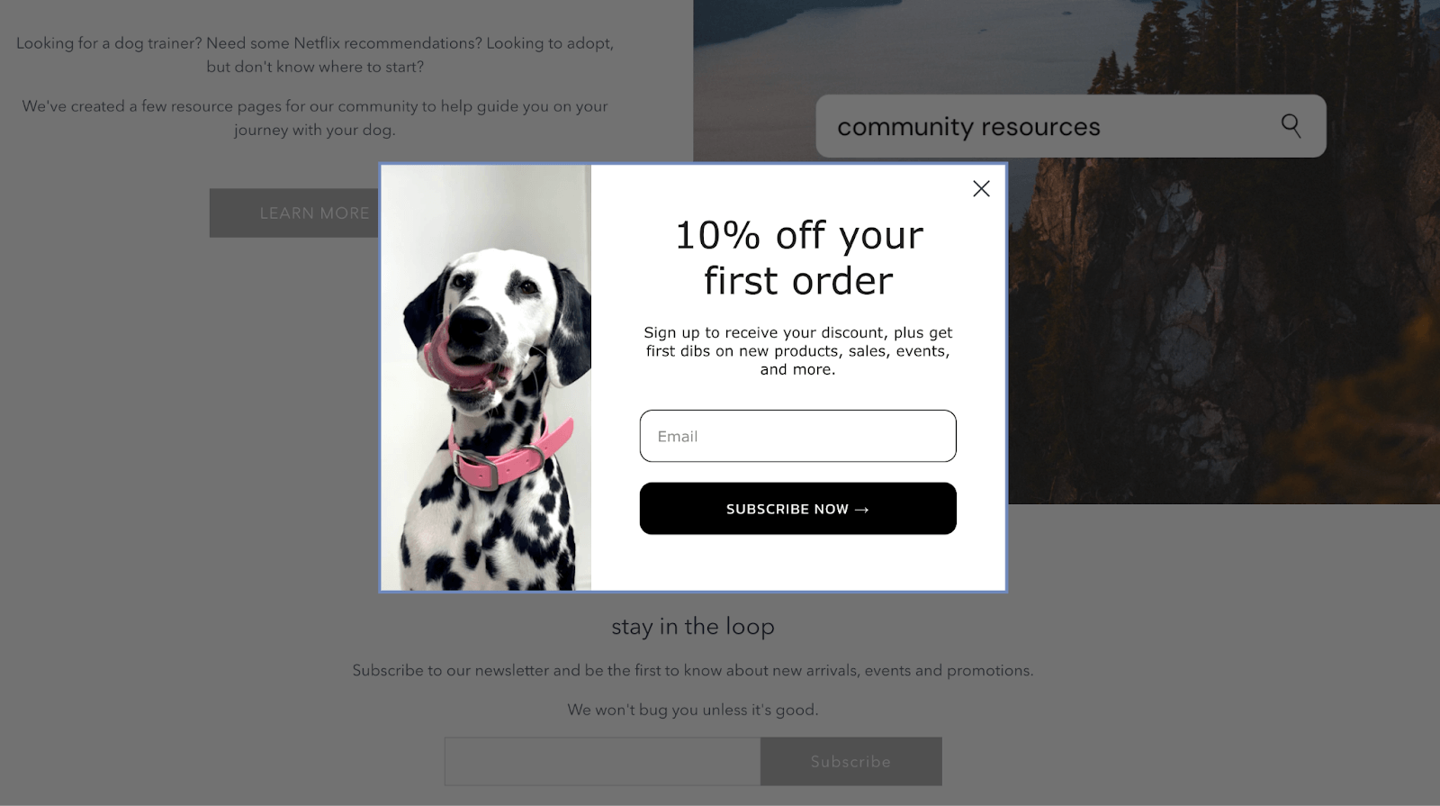
Good Boy Collective’s Newsletter Signup Form
A sticky popup is an attention-grabbing design element that entices users to engage immediately. It remains visible until the user clicks the exit button or subscribes.
Design-wise, the e-commerce company stays true to its branding. Adding an adorable snap of a Dalmatian mid-noselick will make it hard for pooch lovers to look away.
Good Boy Collective leaves no stone unturned by adding another form on the footer. Both have excellent messaging. The pop-up form explains what the reward is for signing up (a 10% discount), as well as what to expect from the brand's email communications (information about new products, sales, and more). But I especially love the “break character” line on the signup footer form: We won’t bug you unless it’s good.
This proves that an email sign up form doesn’t need to be dry. It gives you a chance to show how fresh and engaging your brand can be.
2. Double Soul
Feel-good socks brand Double Soul also features a sticky pop-up form and a footer form. Clearly, this dynamic duo makes a great pair.
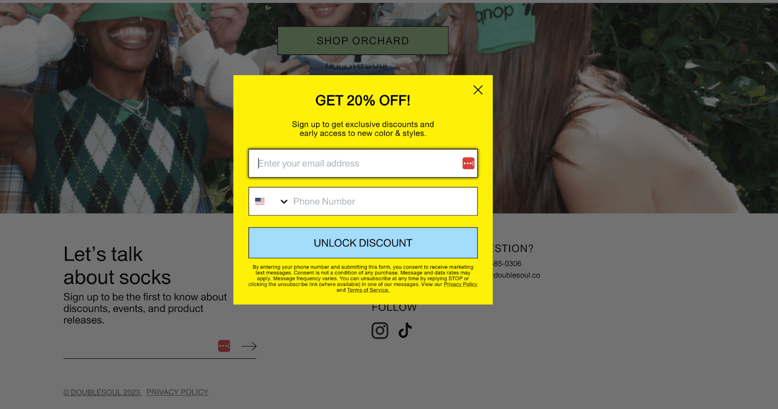
Double Soul’s Newsletter Signup Form
Double Soul’s newsletter sign up incentive and benefits are clearly outlined. But its most striking feature is the call-to-action (CTA) button. The brand departs from the usual “subscribe now” text and uses the words “UNLOCK DISCOUNT” to invoke FOMO and entice visitors to complete the form.
With this small change, it manages to point users’ attention in the desired direction. And this isn’t the only way Double Soul leverages excellent newsletter wording. Once users have filled out the form, a warm welcome message and a discount reminder appear:
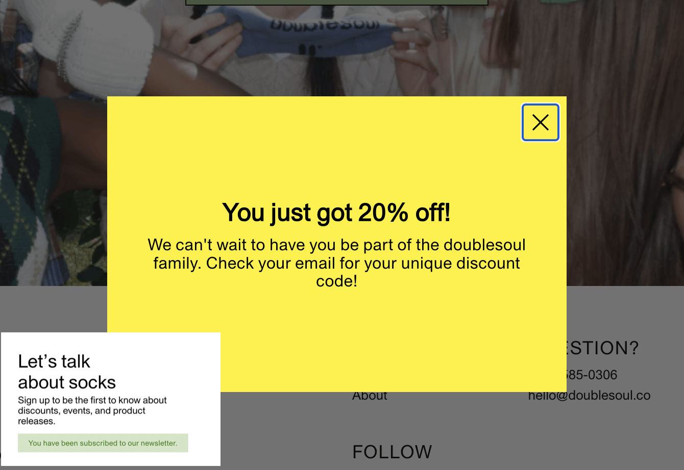
Double Soul’s confirmation message
Both boxes stand out because of their excellent visual design. Double Soul’s use of bright yellow makes them stand out, but not out of place. Contrasting this with simple black fonts tones down its intensity and makes the text readable.
3. Leaf Shave
Sustainable plastic-free razor brand Leaf Shave’s persuasive approach is subtle and off to a good start. This great newsletter signup form example illustrates how forms can set the tone for your email campaigns.
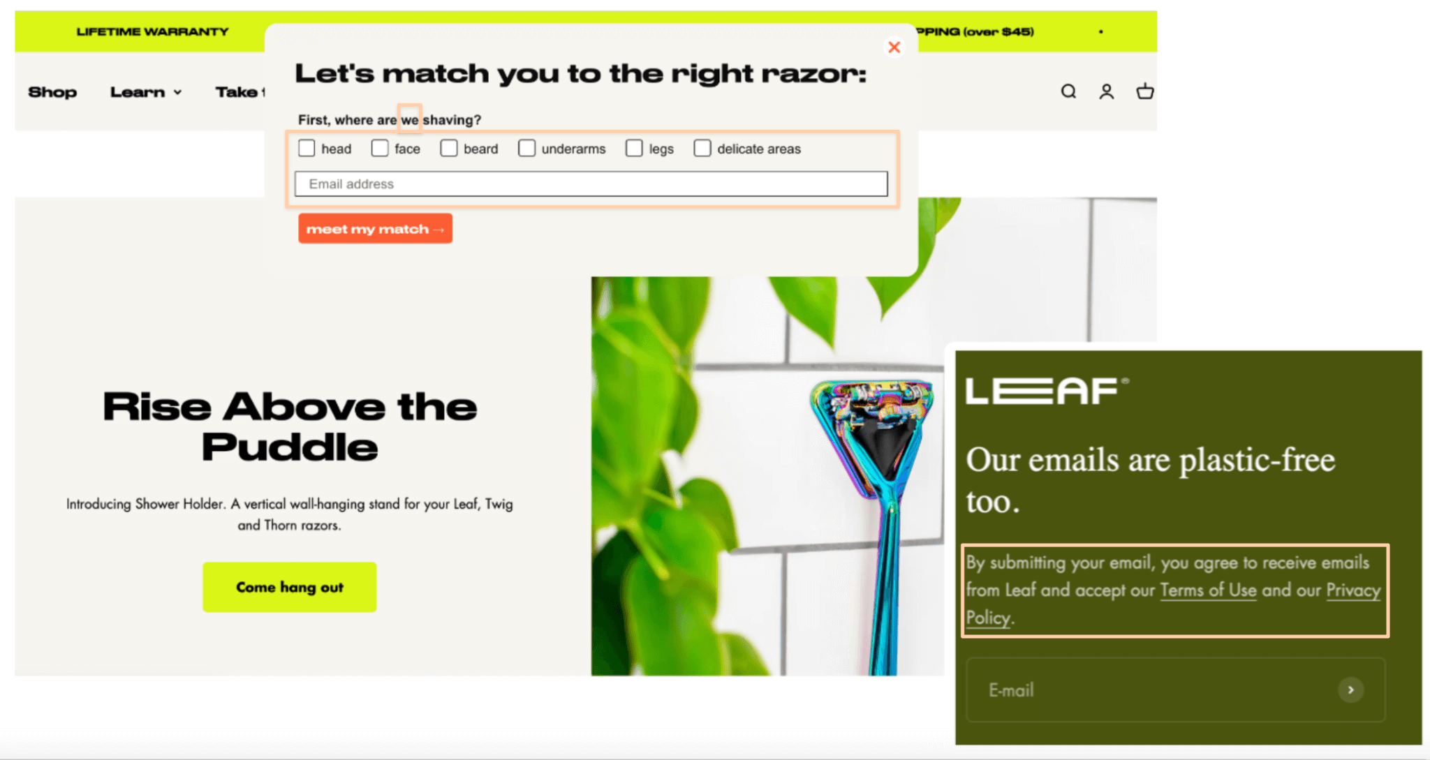
Leaf Shave’s Newsletter Signup Form
With a single simple question about what the razor is for, the brand ensures the first email you’ll receive is personalized to match your need. This can increase the likelihood of a sale and repeat purchases. 59% of shoppers will return to a store if it recommends products to them.
To help subscribers mark response/s, the form features tick boxes. With the right email service tool, this simple addition enables the brand to start segmenting its future email campaigns based on tags.
Its messaging is also excellent. The headlines in both pop-up and footer forms are witty and on-brand. The use of “we” in the question removes the awkwardness of the subject for those who might find it too personal.
Last but not least, Leaf Shave reassures subscribers by sharing links to its Terms of Use and Privacy Policy. You’ve probably noticed the footnotes on Double Soul’s pop-up form, but they’re long and hard to read. Leaf Shave’s approach is more bite-sized without losing the essence.
4. Mejuri
Mejuri, a luxury accessories line sported by celebrated influencers and Hollywood stars such as Sydney Sweeney, brandishes its email subscription pop-up at the outset:
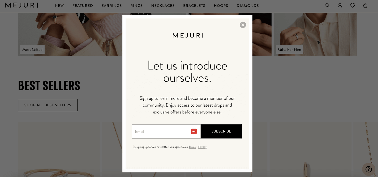
Mejuri’s Newsletter Signup Form
Its design is elegant and muted, in keeping with the rest of the website. More importantly, it has all the essential elements: a readable headline, text that explains the perks of signing up, a prominent CTA, and a quick line of its Terms of Use and Privacy Policy.
There's only one thing I'd change: Make the headline more brand-appropriate and customer-focused. Something like “Stay sophisticated and in the loop” sounds a lot better than “Let us introduce ourselves.”
Now while a pop-up’s conversion rate can reach as high as 42.35%, it isn’t everyone's cup of tea. Some people might find it disrupting. Hence, some brands opt for embedded on-page forms.
5. Le Puzz
One way vintage puzzle maker Le Puzz ensures user experience isn’t disrupted is through a sign-up form in the footer. Footer forms sit at the bottom of the page and work well with highly engaged visitors.
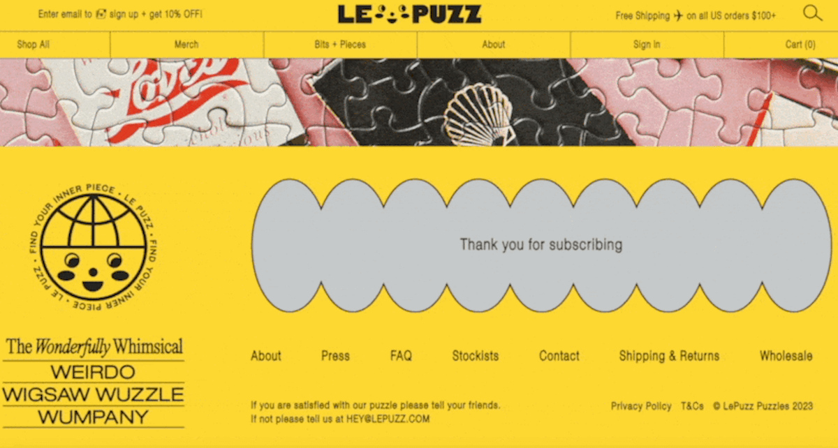
Le Puzz’s Newsletter Signup Form and Confirmation Page
Le Puzz is fun and hip, and its hard-to-miss footer follows suit. The form is huge without looking cluttered. The brand also provides a short but clear confirmation message upon successful subscription.
However, its user-friendliness could be improved. The text box isn’t obvious and only appears if you click on the right area. People may mistake the arrow as a link to a dedicated page.
The brand should also highlight the benefits of joining. The website's header shows that subscribing rewards you with a 10% discount. But not everyone might see that. Plus, with the form located at the bottom, forgetful folks may also miss out on the opportunity.
6. L&S Leather
L&S Leather, an online store for customized leather products, does a good job of drawing attention to the value of signing up.
This signup form example also features a design element we haven’t seen in previous examples: a teaser.
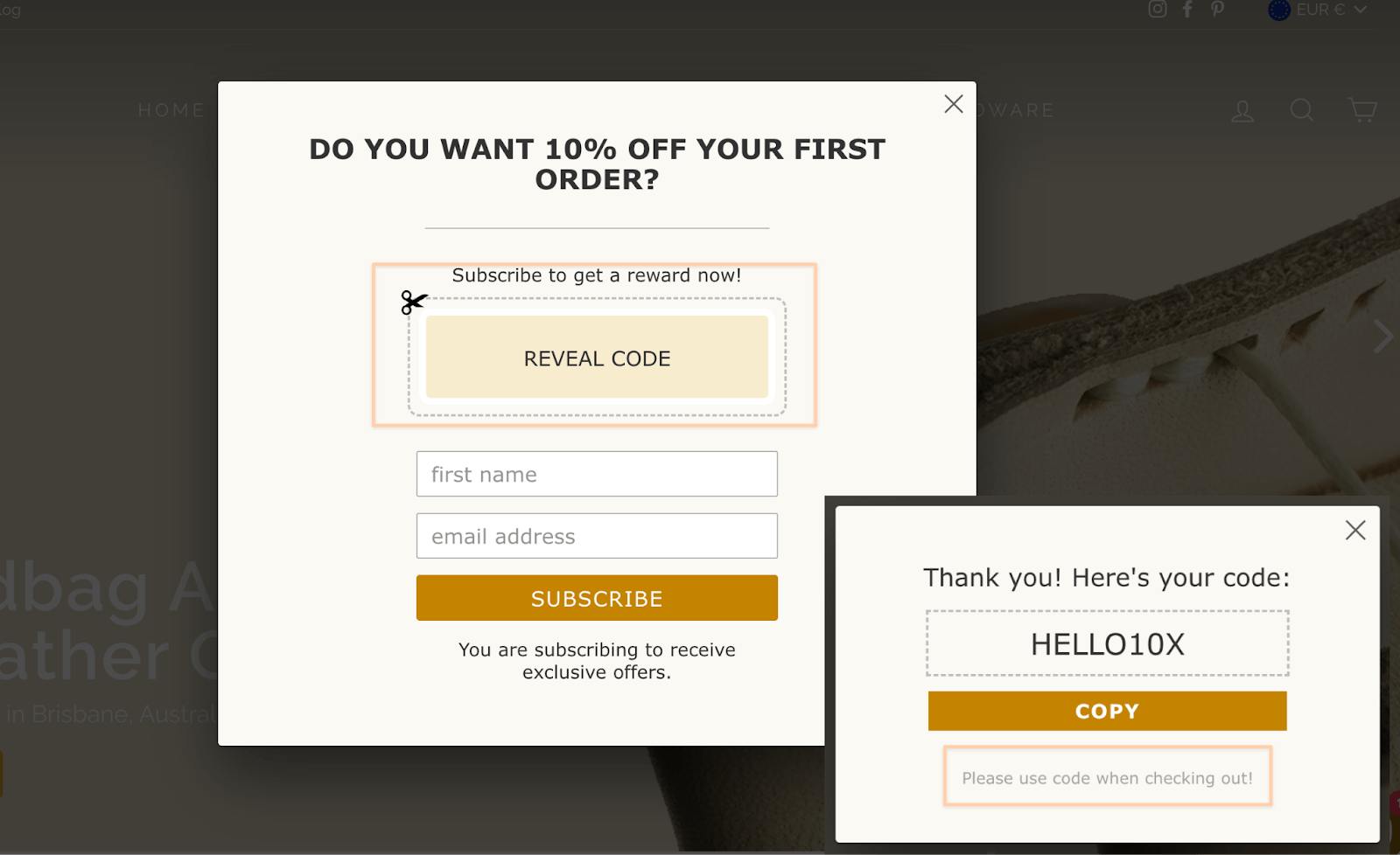
L&S Leather’s Newsletter Signup Form and Thank You Message
Many of the email signup form examples that incentivize subscribers with a reward always require them to check their email to claim the discount.
However, L&S’s “REVEAL CODE” icon gives the impression that the discount is within reach. And it is! Once you leave your name and email address and press subscribe, the code will appear. There’s also a thoughtful reminder to use the code at checkout.
7. Wayre
Modern traveler apparel brand Wayre has a newsletter popup form on their homepage that covers all the bases: discount offer, privacy policy, brand-consistent graphics and typography, interesting copy, a clever CTA, and an opt-in box for news and offers.
You'll want to take notes because it's one of the best:
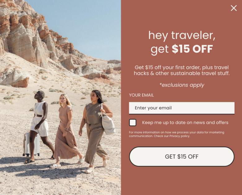
Wayre's Newsletter Signup Form
But Wayre uses forms in another interesting way. On top of this already effective form, the brand lures back interested shoppers with an exit intent pop-up that appears on the checkout page.
Exit intent popups appear whenever visitors indicate they want to leave a page, such as hovering towards the back or X button, or simply moving away from the main viewport.
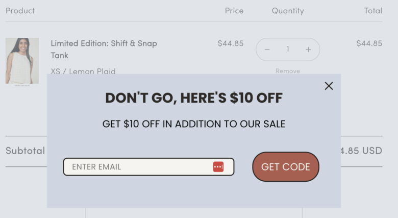
Wayre's Exit Intent Pop-Up
While it’s not strictly a newsletter signup form – instead, the focus is to inspire shoppers to return to their carts after abandoning them – we thought it was worth mentioning. By focusing both the messaging and CTA on the additional discount, the popup becomes a convincing and actionable way to convert shoppers – a strategy you could also use in your newsletter signup forms.
Service-based Providers and B2B Companies
Employing a newsletter marketing strategy is a great way to build trust with your audience. Freelancers, boutique firms, and agencies in particular can use newsletters to cement their expertise. Here are some email signup form ideas for service-based organizations:
8. Goat Agency
Global Influencer Marketing firm Goat Agency keeps its email sign up simple and professional. The agency has a simple button on the homepage that directs visitors to a sign up page.
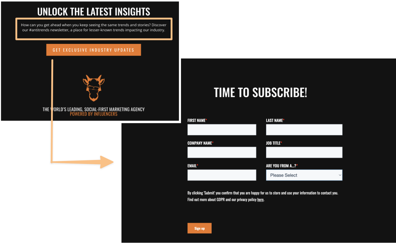
Goat Agency’s Newsletter Signup Form
Unlike ecommerce brands, service-based organizations can't give away discounts readily. Goat Agency opts to gift subscribers with industry updates in exchange for their subscription.
The straightforward newsletter subscription copy emphasizes the agency's expertise and what it stands for. At the same time, it oozes character.
The sign-up form itself is simple. With the right form fields, the agency is able to segment readers and target them accordingly.
9. Kaleigh Moore
Kaleigh Moore runs an insightful weekly newsletter about writing and freelancing, two subjects she's an authority on. She also has a full page dedicated to her sign-up form. 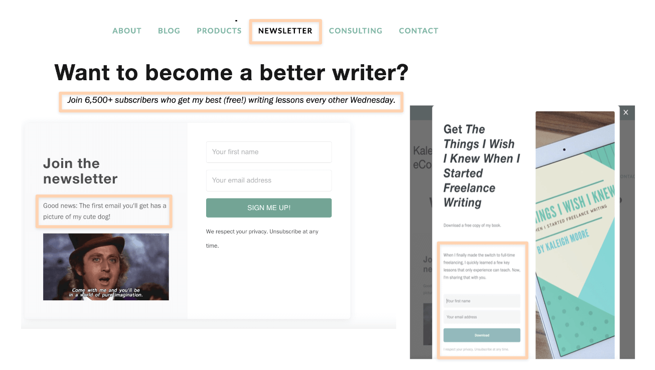
Kaleigh Moore’s Newsletter Sign up Page
For some, there’s not enough room in a pop-up or the footer to talk up their newsletter. Having its own page allows you to do so. Plus, it gives the page a chance to earn its own SEO brownie points.
Kaleigh leverages hers to set subscriber expectations and display social proof elements like subscriber count, testimonials, and reviews. Social proof elements can increase subscriptions by around 144.62%.
She also employs a sticky pop up to tell subscribers about a free eBook they'll receive when signing up. It’s both a treat and a teaser of her newsletter's value.
10. Young & Co
Branding agency Young & Co’s pop-up newsletter sign-up form borrows many of its design elements directly from its website. The blue color, which is part of its color palette, provides an eye-catching contrast to the background.
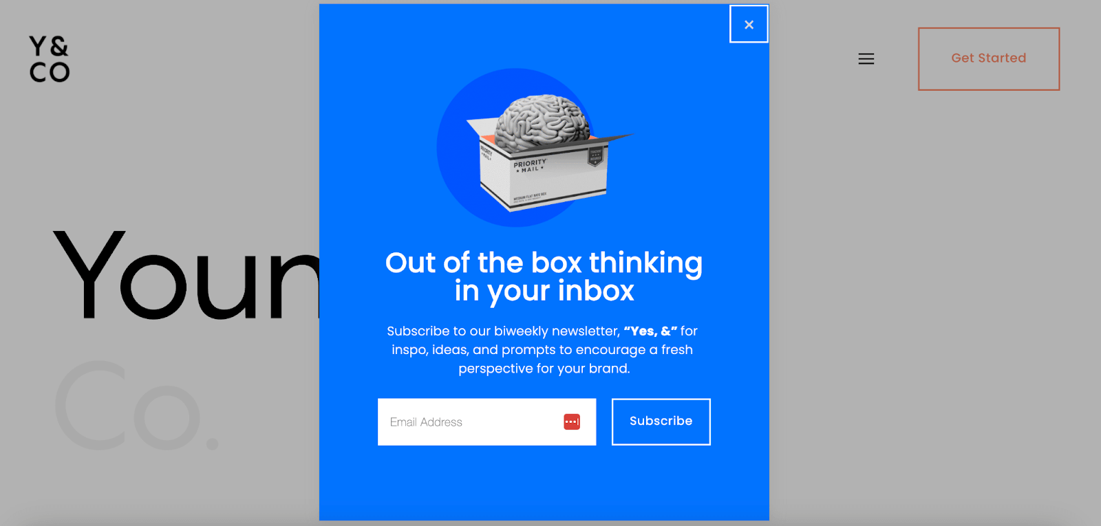
Young & Co’s Newsletter Signup Form
The GIF image of a brain going into a box seems peculiar from the outset. But it's in line with the copy and represents what the organization's newsletter “Yes, &” stands for. There’s also a great deal of meaning and intrigue in the wordplay on the headline.
11. HummingYard
Newsletters aren’t just for the corporate world. They’re just as powerful a customer nurturing tool for trade contractors.
Outdoor landscape architectural firm HummingYard understands this. The company uses a clean sign-up form to get leads:
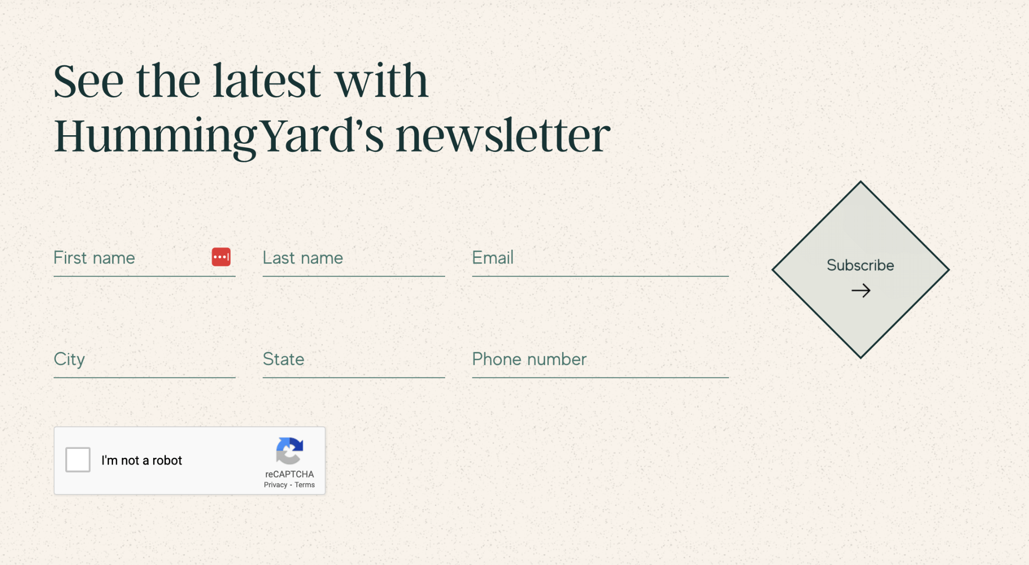
HummingYard’s Newsletter Signup Form
Research shows that signup forms work best if they have no more than three fields. In fact, 3 is the magic number. So is it a risk for HummingYard to double the number of recommended fields?
Not really. Best practices suggest keeping it short, but the number of fields you need will depend on your company’s industry and campaign goals.
For HummingYard and its services, location is a big factor. Furthermore, the simplicity of the subscription form’s design balances the number of fields present. The padding, layout, font, and CTA button all work together to make it look simple and quick to fill out.
12. Alisson Jaffe
So far, we’ve seen forms on footers, pop-ups, and even a dedicated newsletter page. Allison Jaffe Interior Design firm’s newsletter subscription form is not any of the above. It takes the form of a slide-in.
Allison Jaffe’s Newsletter Signup Form
Slide-ins are pop-up’s timid younger brother. These dynamic elements slowly slide into view without disrupting the page layout. It provides users with a more seamless experience because it doesn’t disturb their scrolling.
The interior design firm’s simple sign-in form floats up once you hit the bottom of the homepage. Its design, like the modal overlays it’s delivered in, is simple and straightforward. Clear copy, muted colors, topped off with welcoming imagery.
13. Becca Jean Photography
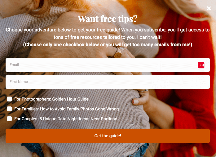
Becca Jean's Newsletter Signup Form
Here's a user-friendly signup form that simplifies segmentation right from the start! Photographer Becca Jean not only prominently features her slide-in subscription form on various pages of her website and blog, but she also invites subscribers to select their preferred newsletter content. Subscribers have the option to receive tips about family shoots, couples shoots, or photography in general.
This approach ensures that subscribers receive content tailored to their specific interests. Becca even recommends that subscribers choose just one checkbox to avoid an overload of emails, although they are welcome to select multiple checkboxes if they prefer. The key here is to empower readers to make their own selections, which can significantly enhance overall engagement rates.
(By the way, if you're a photographer, be sure to check out our full guide on email marketing for photography for more inspiration.)
Food and Beverage
Through email marketing, the food and beverage industry can build and strengthen its following. For example, restaurants that employ email marketing benefit from exposure since their open rates can reach 70%. If you offer dining experiences or culinary delights, these newsletter sign up examples are here to serve some inspo:
14. Canevari’s Deli
Canevari’s Deli offers a ravioli subscription program. Because who doesn’t love ravioli? A sticky pop-up lets you sign up for a discount to this scrumptious meal plan (and their newsletter at the same time).
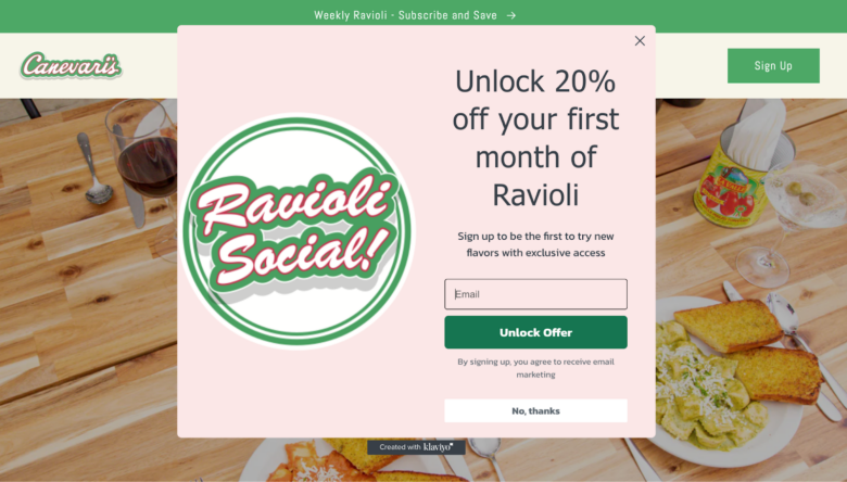
Canevari’s Deli’s Newsletter Signup Form
The deli deserves plus points for adding a thoughtful accuracy disclaimer about receiving marketing emails. Topping it with a simple “No, thanks” button increases user-friendliness. It gives uninterested individuals an alternative option to close the box and keep browsing – a much better experience than clicking the fiddly X button in the top right.
The confirmation message adds another thoughtful touch. Canevari’s take it as an opportunity to share more info, along with a mouth-watering photo that will make you feel good about signing up.
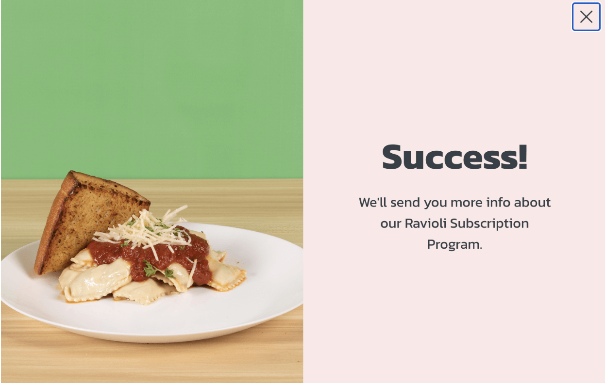
Canevari’s Deli’s Confirmation Message
15. Honest Burgers UK
Honest Burgers UK’s newsletter sign-up form isn’t directly available on the homepage. The chain restaurant places a CTA button on the homepage’s footer to help visitors get to the dedicated email sign-up page.
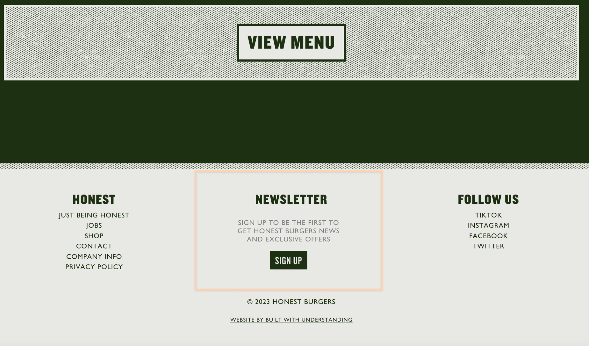
Honest Burgers UK’s Homepage
This email sign up page is the longest on our list. But it’s exactly what the restaurant needs to send out targeted messages.
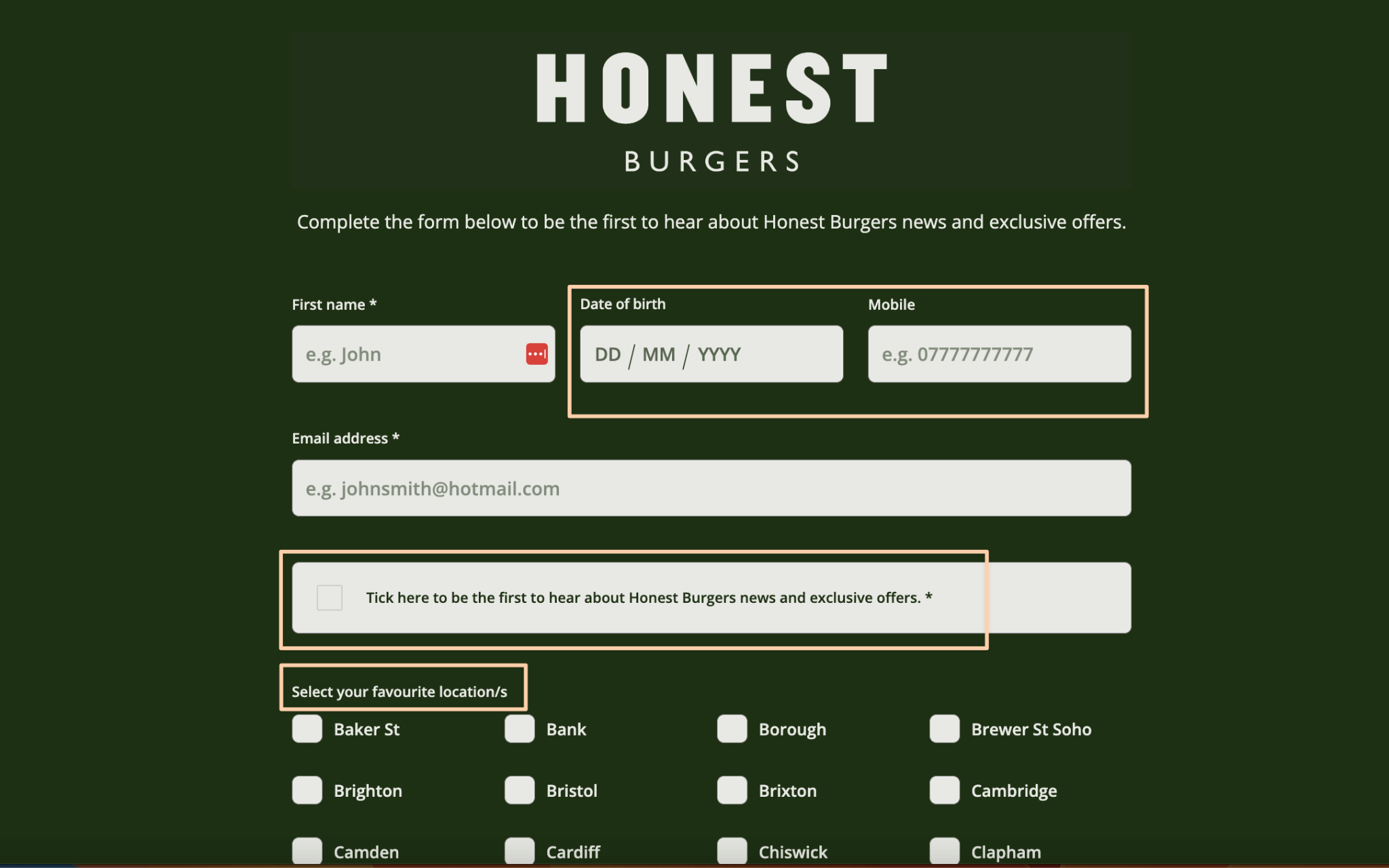
Honest Burgers UK’s Newsletter Form Page
Adding a birth date could help them send birthday messages and discounts to patrons. It’s a powerful restaurant email marketing strategy that can deliver an impressive 11.6% conversion rate.
Locals may only want to try some of the specials offered in their area. Flooding them with irrelevant offers could cause them to unsubscribe. To further improve personalization, the restaurant adds checkboxes for location.
As another measure to deter unsubscribes, Honest Burgers provides an opt-in box for marketing emails. You can simply leave the box unticked if you aren't interested.
16. White Claw
Every website footer is a busy place. Yet Seltzer brand White Claw manages to shine the spotlight on their newsletter.
Most footer forms are small. But White Claw’s form calls attention by occupying space. The brand also has a pop up which looks the same as its footer form:
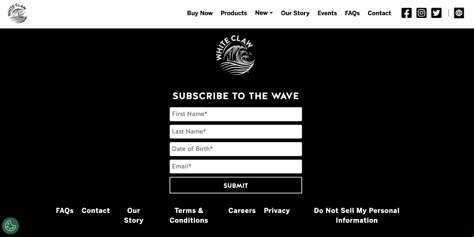
White Claw’s Newsletter Signup Form
Keeping its newsletters targeted to the right audience is part of the beverage company's responsible business practices. The inclusion of the date of birth field helps them do just that.
Therefore, while three is a magic number in form fields, four isn't a crowd. In some cases, it’s a necessity.
Influencer/Coaches/Media Personalities
An effective email marketing strategy increases your following. For many online personalities, this is their bread and butter. Here are some ways you can call attention to your newsletter sign up form:
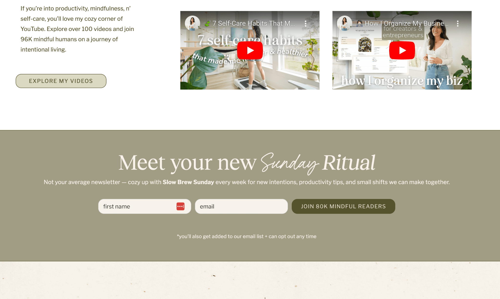
17. Jules Acree
Unlike the other email sign up form examples on the list, lifestyle digital creator Jules Acree’s is static. This is called an embedded form–and you can have more than one on the same page to increase visibility.
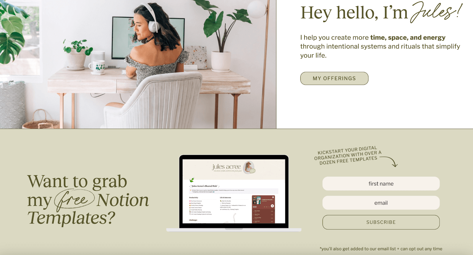
Jules Acree’s Newsletter Signup Form
The ‘intentional' lifestyle influencer places the first one above the fold, sitting below her banner image. A sneak peek at the freebie she offers for signing up can motivate visitors to do so.
The second one is a signup form for a weekly newsletter called Slow Brew Sunday. It’s found close to the bottom of the page. For social proof, she adds the number of readers in the CTA button.
Jules Acree’s Newsletter Signup Form
Without the proper look and feel, however, it is easy to scroll past these two blocks. Jules draws attention to them by using shades of olive green against her website’s off-white canvas. She tops it off with eye-catching fonts that don’t clash with her website’s aesthetic.
18. Justina Vanessa
Lifestyle blogger Justina Vanessa also features two on-page newsletter signup forms on her homepage. One appears slightly below the fold. But it’s easy to spot because it’s right under her featured post header.
The second is squeezed between her blog posts.
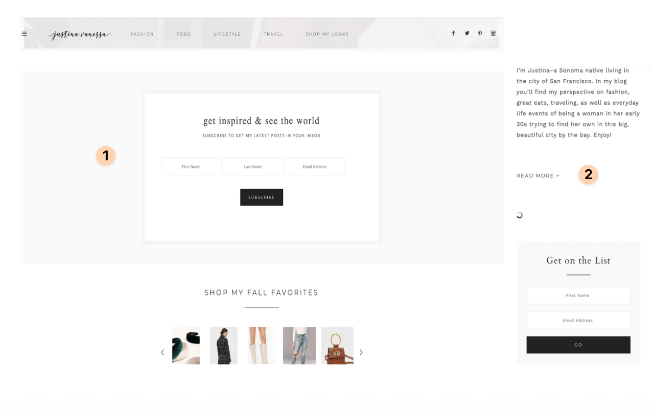
Justina Vanessa’s Newsletter Signup Form
Both placements work well because Justina’s sign up incentive is to keep people up-to-date with her blog posts. If web visitors like what they read, these newsletter signup forms are just a mouse click away.
Design-wise, Justina keeps her forms muted and organized. She doesn’t play with colors to call attention to the forms. But rather, she uses frames to make them stand out.
19. It’s ADHD-friendly
Our newsletter sign up form examples vary for a reason. You have to do what works for you. Sticky pop-ups and footers are a favorite combo. Some need two embedded forms. Others have dedicated newsletter subscription pages. Then, there are those that only need a single line on their webpage.
ADHD life coach Caren Magill’s newsletter sign up is a short and simple sticky bar that lives at the top of her website pages.
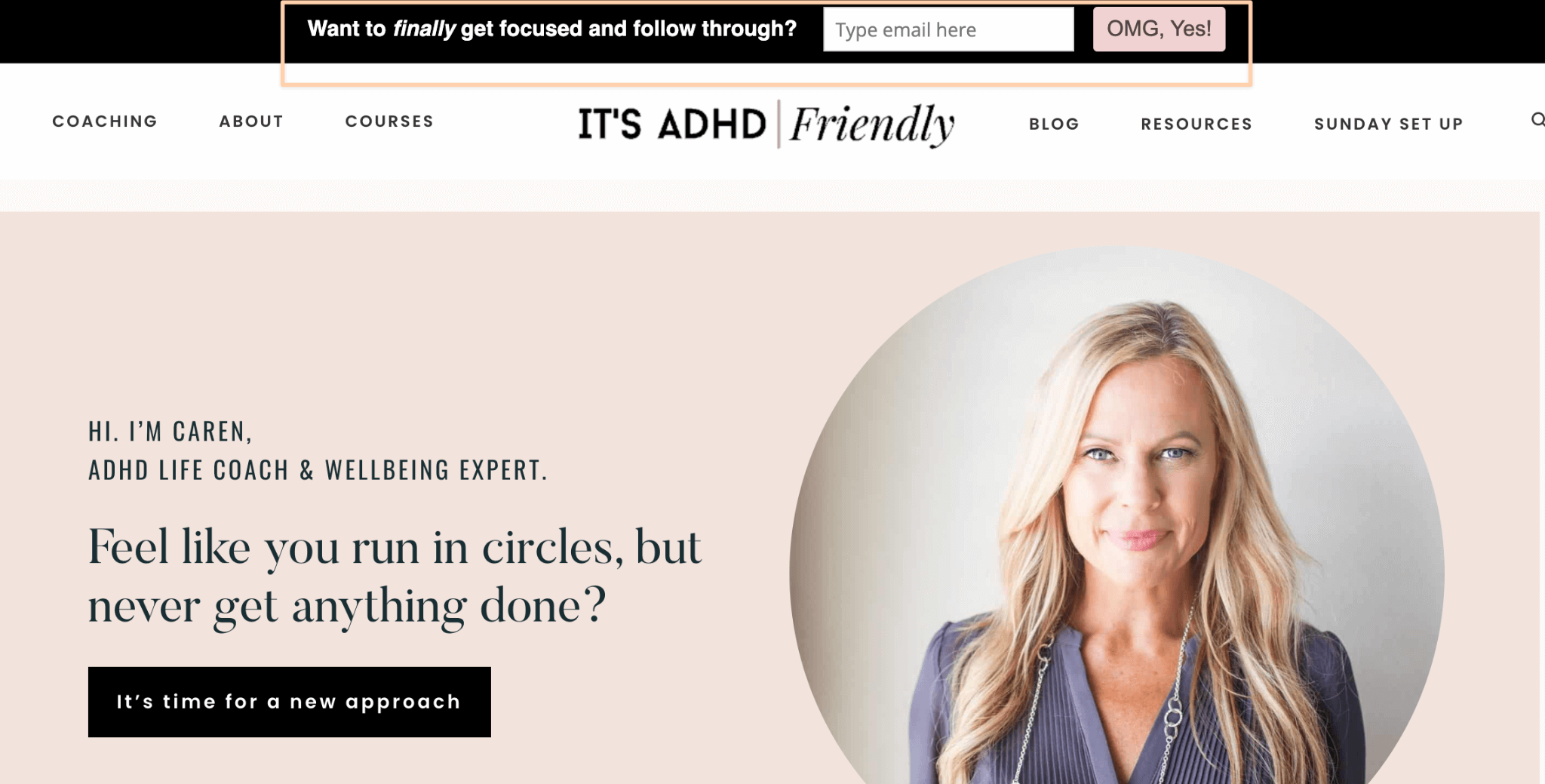
It's ADHD-friendly’s Newsletter Signup Form
It features a one-liner question that says so much about what the wellbeing expert can help visitors with. She pairs it with a CTA button full of vigor, helping to build excitement around the act of signing up.
Quick Recap: Best Practices We've Seen on Favorite Newsletter Sign-up Forms
It's been great learning from these examples, hasn't it? Let's go over what they did well so you can replicate it:
Find a prominent spot on your website: Proper placement will draw more eyeballs. Above-the-fold placement often works best because it eliminates the need for scrolling. But footer forms work better for providing accessibility to engaged visitors.
Examples that do this best:
- Good Boy Collective’s pop up + footer form (#1)
- Le Puzz’s footer form (#5)
- Wayre’s exit intent popup (#7)
- Kaleigh Moore’s newsletter page (#9)
- Ashley Jaffe’s slide-in form (#12)
- Jules Acree’s embedded form (#17)
Make it pop: Form and function are key to designing a newsletter sign up section that stands out and is easy to navigate. Think minimalist and brand-aligned elements when choosing design elements. Opting for loud and clunky text, form fields, or buttons might sacrifice user experience and your website’s aesthetics.
Examples that do this best:
- Mejuri (#4)
- Wayre (#7)
- Young & Co (#10)
- HummingYard (#11)
- Justine Vanessa (#18)
Use compelling and informative language: Be clear about what subscribers should expect from your communications. For instance, describe its content and frequency. Best of all, don’t be stiff when doing so. Consider injecting humor if your branding allows it. Visitors will see your unique newsletter subscribe message as a hint at what's to come.
Examples that do this best:
- Good Boy Collective (#1)
- Double Soul (#2)
- Leaf Shave (#3)
- Wayre (#7)
- Goat Agency (#8)
- Kaleigh Moore (#9)
- Jules Acree (#17)
- It’s ADHD-friendly (#19)
Call out incentives and benefits: Showing potential subscribers “what’s in it for them” can drive up conversions. Highlight value propositions such as promotions, exclusive content, updates, and industry insights.
Examples that do this best:
- All ecommerce examples, except Le Puzz
- Kaleigh Moore (#9)
- Jules Acree (#17)
Demonstrate social proof elements: Displaying testimonials, reviews, and existing subscriber counts encourages signups. It builds trust and helps visitors recognize your brand’s expertise in the field. It also turns your newsletter into a community. People are more likely to subscribe if they see your newsletter as such.
Examples that do this best:
- Kaleigh Moore (#9)
- Jules Acree (#17)
Be transparent and ensure privacy: Security badges and privacy assurances create a sense of trustworthiness. You don’t have to go too deep into the weeds. Simply add reCAPTCHA or a link to your privacy policy explaining how you’ll use and protect their details. To increase transparency, alert or offer interested parties the choice to opt-in.
Examples that do this best:
- Double Soul (#2)
- Leaf Shave (#3)
- Mejuri (#4)
- Wayre (#7)
- HummingYard (#11)
- Honest Burgers (#15)
Use a clear and concise CTA: Focusing on the major benefit, using action-oriented language, or a reader-centered approach can propel users to act. Aside from using powerful language, you can use a different color or typeface.
Examples that do this best:
- Double Soul (#2)
- Leaf Shave (#3)
- Wayre (#7)
- Canevari’s Deli (#14)
- Jules Acree (#17)
- It’s ADHD-friendly (#19)
Craft a thoughtful confirmation or Thank You message: Don’t just take email addresses and call it a day. Leaving a short but sweet confirmation message can make a difference [how? Make it more endearing]. Plus, you can use this opportunity to share additional information or exclusive content.
Examples that do this best:
- Double Soul (#2)
- Le Puzz (#5)
- L&S Leather (#6)
- Canevari’s Deli (#14)
Limit form fields: The more complex your form is, the fewer people are willing to complete it. Only include form fields that resonate with your campaign goals. If you’re a blogger who wants to send content updates to your readers, there’s no need to ask for their location. Name and email address are more than enough.
Examples that do this best:
- All our signup form examples are short, but Goat Agency, HummingYard, and White Claw illustrate the need for longer forms
Okay, now these last two tips can’t be seen in our newsletter sign up form examples roundup. But we’re generous around here, so here they are:
Check form responsiveness: Sign-up forms should be mobile-friendly and display properly on various devices and screens.
Test and optimize regularly: A/B test designs, copy variations, CTAs, and incentives. Then assess user feedback and data to refine and improve the form.
Use These Strategies To Improve Your Newsletter Signup Form Today
Before coming up with irresistible newsletter content ideas, design an irresistible email sign up form first. See how you can work these best practices inspired by our examples into your current subscription form.
Once you’re done and happy with your form, you can go ahead and start planning your email marketing content. In fact, we recommend that you do. So we’re leaving you with some reading suggestions:
- Read marketing email tips here.
- Learn the benefits of newsletters, newsletter best practices and the best times to send them.
- Or get inspired by these examples and templates.
- Check out some other clever lead magnet ideas.
The authors
Learn more about us

Our Methodology
This article has been written and researched following our EmailTooltester methodology.
Our Methodology